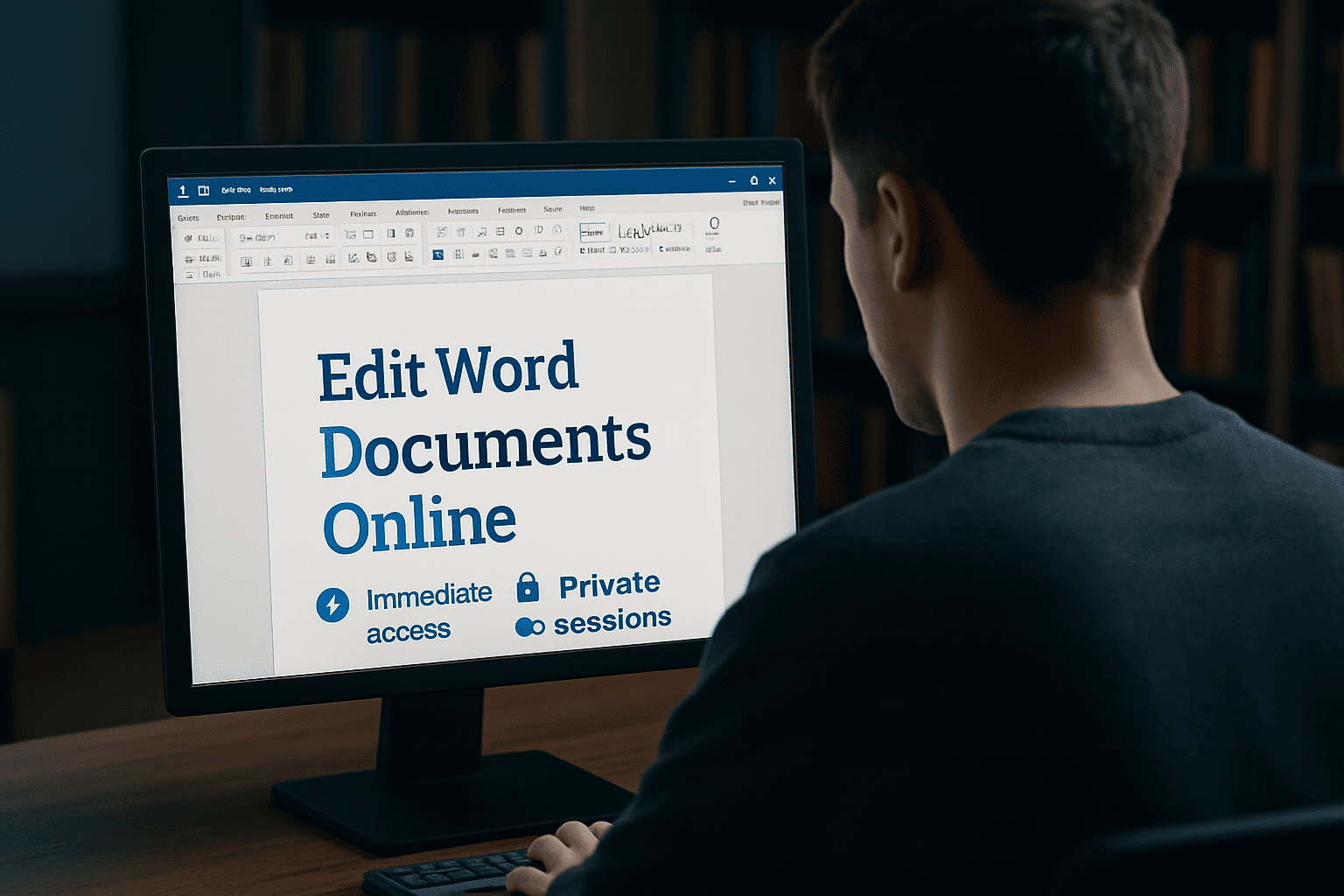
If you need to edit Word documents online free, OffiDocs gives you instant access to a full-featured Word editor right in your browser. No downloads,
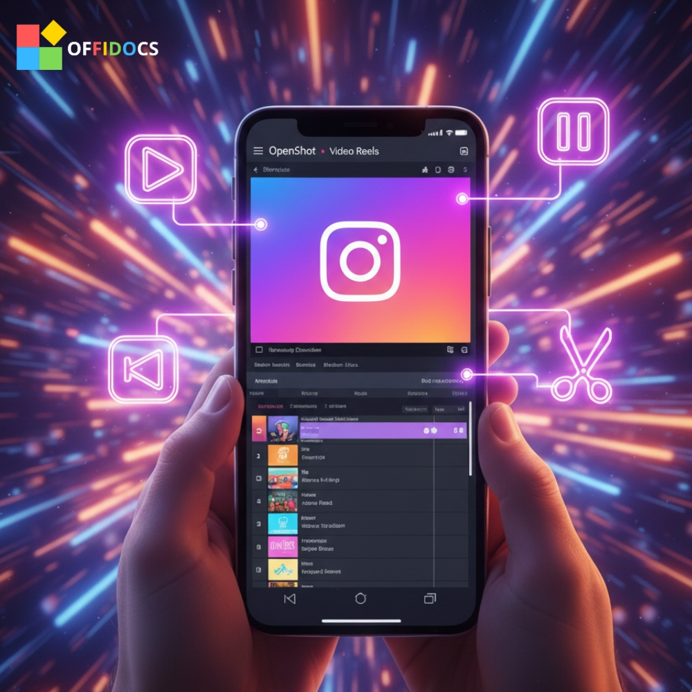
Want to edit Instagram Shorts online without downloading any software? With OpenShot Video Editor, you can create stunning vertical videos right from your browser —
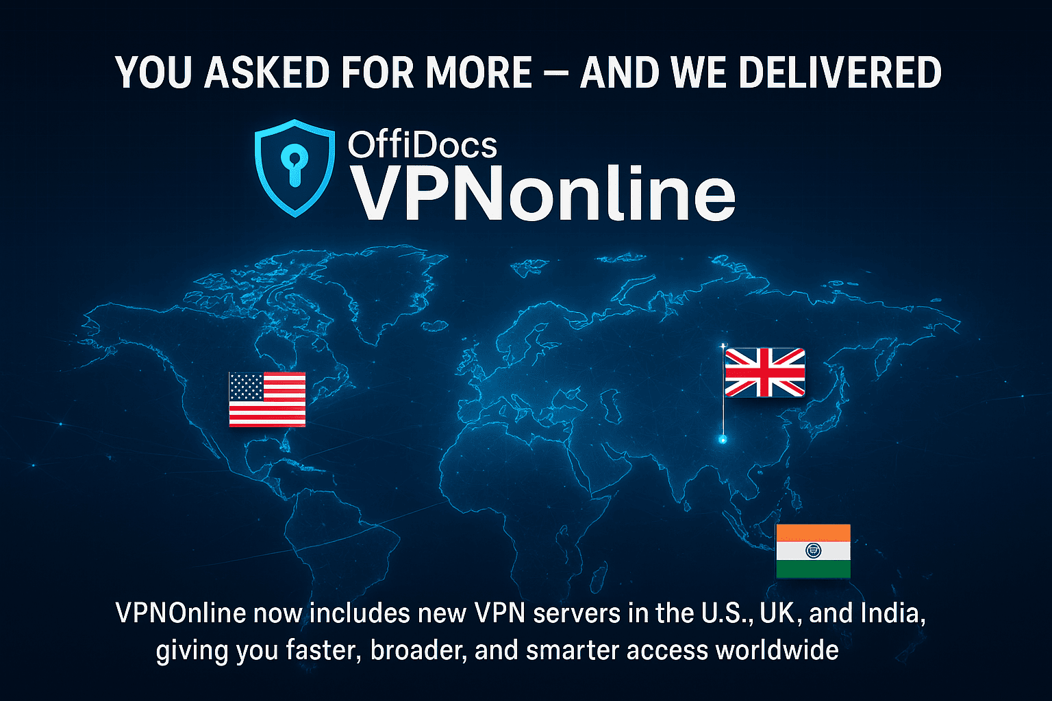
You asked for more — and we delivered. OffiDocs VPNOnline now includes new VPN servers in the U.S., UK, and India, giving you faster, broader,
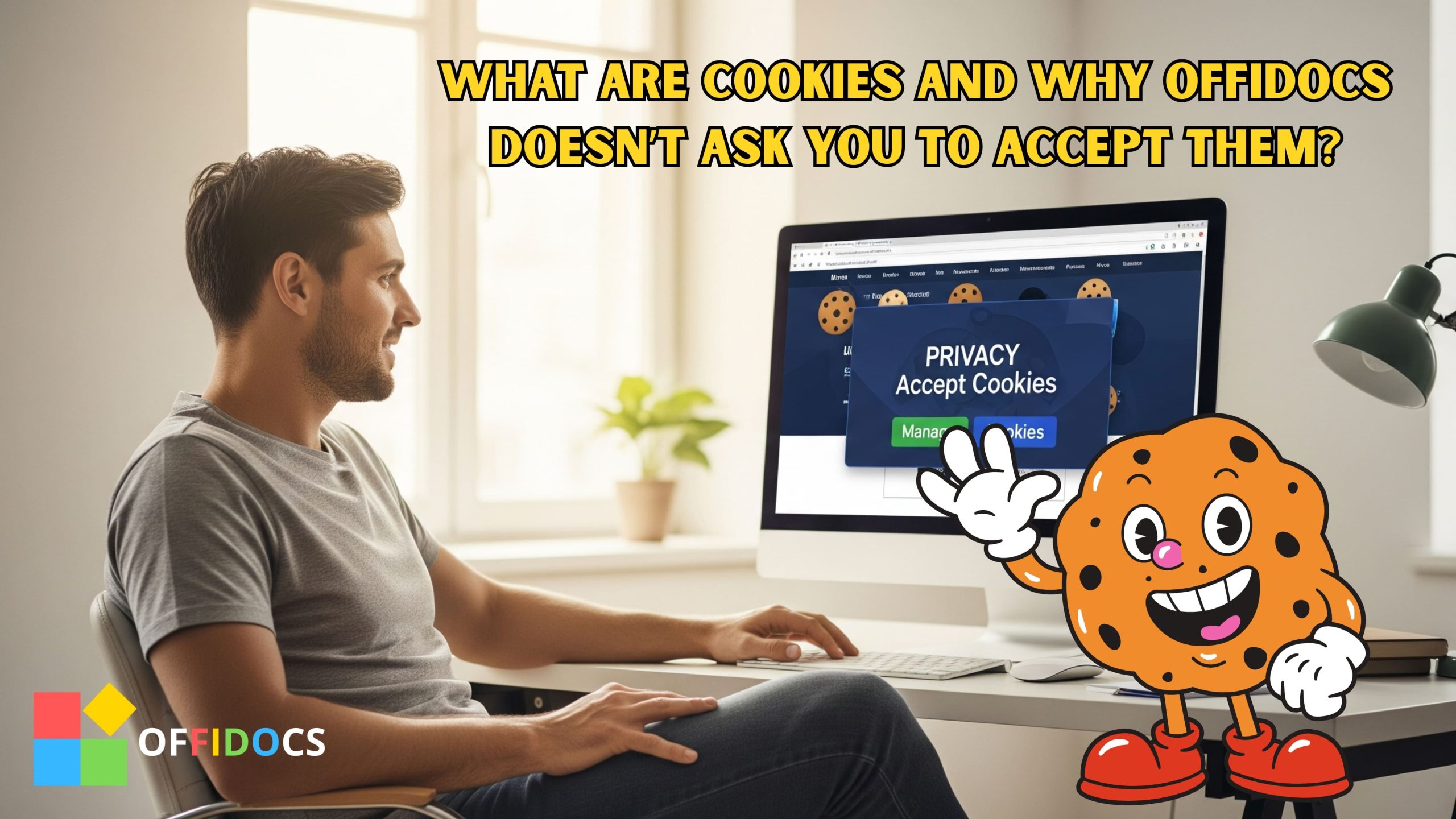
Cookies are a common part of modern web browsing, but many people don’t fully understand what they are, what they’re used for, and their implications

When I first arrived at OffiDocs, I found myself in front of a very complete platform, full of free tools and functionalities. As a new
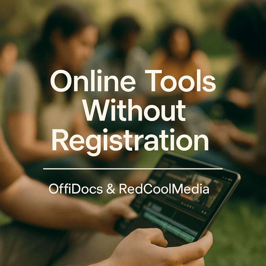
The Keyword: Online Tools Without Registration In today’s digital era, surfing the web often feels like navigating a labyrinth. Cookie pop-ups, endless registration forms, and
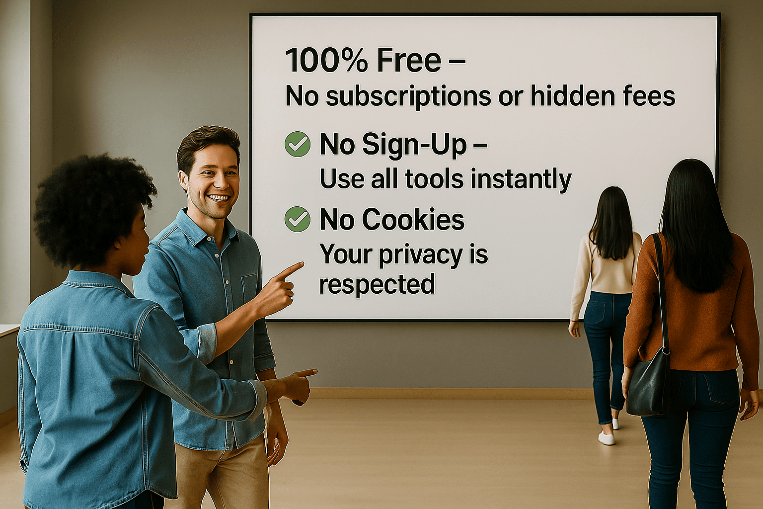
Are you looking for free online productivity tools that work without installations, annoying ads, or creating an account? Welcome to OffiDocs, a platform offering powerful

Did you know that most websites today won’t let you in without making you click “accept” on cookies, create an account, or fill out a
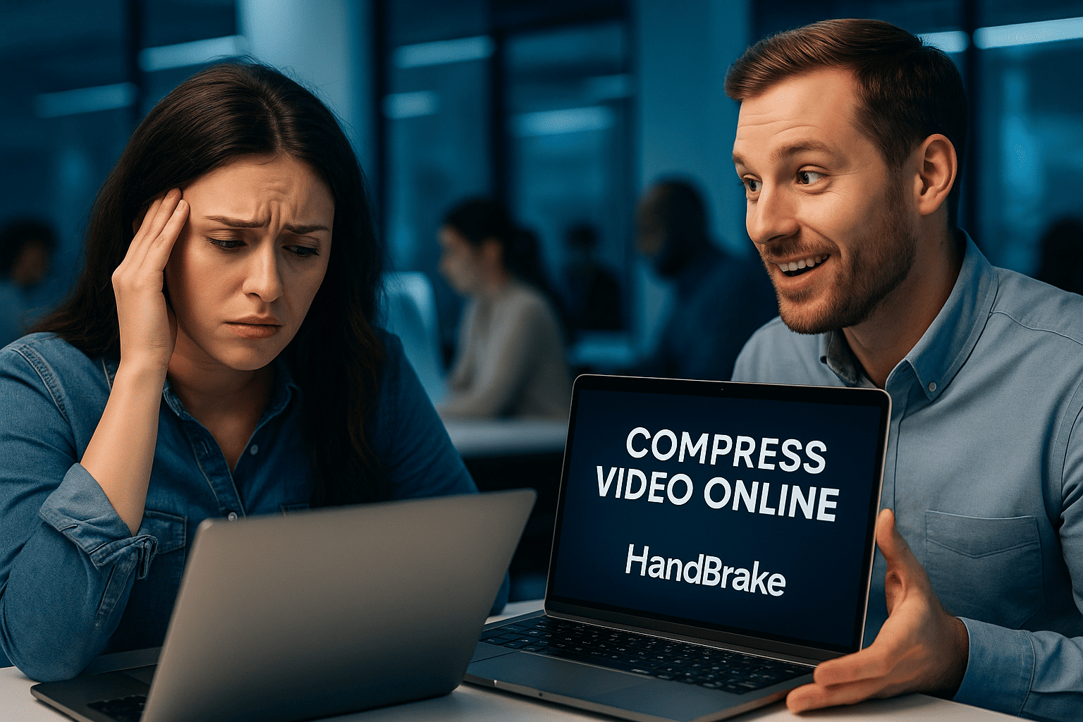
Managing large video files can be frustrating—especially when you need to share them quickly or save space. That’s where HandBrake Online helps. This powerful, browser-based
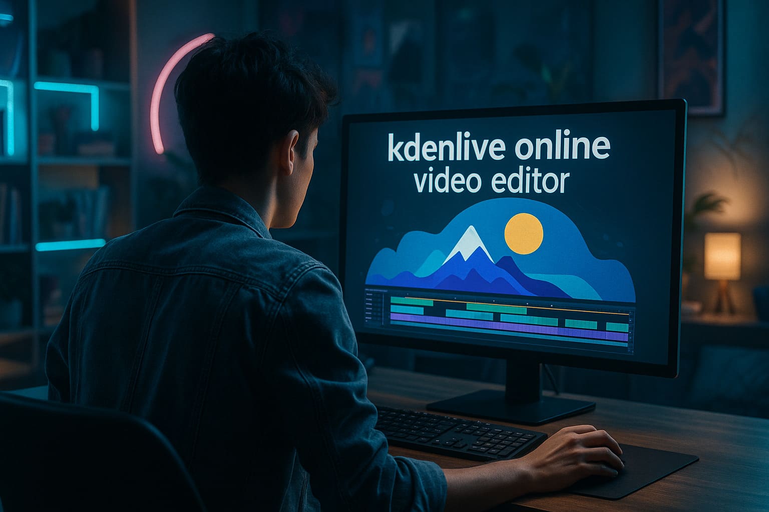
Creating high-quality video content no longer requires expensive software or high-end hardware. With the rise of browser-based tools, professional video editing is now accessible to
