
A double Y-axis graph, also known as a dual-axis or twin-axis chart, is a valuable visualization technique for comparing two sets of data with different units or scales on a single graph. In this comprehensive guide, we’ll explore what double Y-axis graphs are, when to use them, and how to create and interpret them effectively.
What is a Double Y-axis graph?
A double Y-axis graph is a type of chart that displays two separate sets of data using two Y-axes that share a common X-axis. Each Y-axis represents a different scale or unit of measurement, allowing you to visualize and compare two datasets with distinct numerical values.
When to Use Double Y-Axis Graphs?
Double Y-axis graphs are valuable in the following scenarios:
- Comparing Diverse Data: When you want to compare two datasets that have different units or scales, such as sales revenue (in dollars) and customer satisfaction scores (on a scale of 1 to 10).
- Highlighting Relationships: When you suspect a relationship or correlation between two variables and want to visualize how changes in one variable impact the other.
- Efficient Communication: When you need to convey complex data relationships clearly and concisely to stakeholders, such as in reports or presentations.
Creating a Double Y-Axis Graph
Here’s a step-by-step guide on how to create a double Y-axis graph:
1. Prepare Your Data:
- Organize your data in a spreadsheet, with one column for the X-axis values and two separate columns for each set of Y-axis values.
2. Select Your Data:
- Highlight the data you want to include in the double Y-axis graph, including the X-axis values and both sets of Y-axis values.
3. Insert a Chart:
- Click on “Insert” in your preferred spreadsheet software (e.g., Excel, Google Sheets).
- Select “Chart” from the menu.
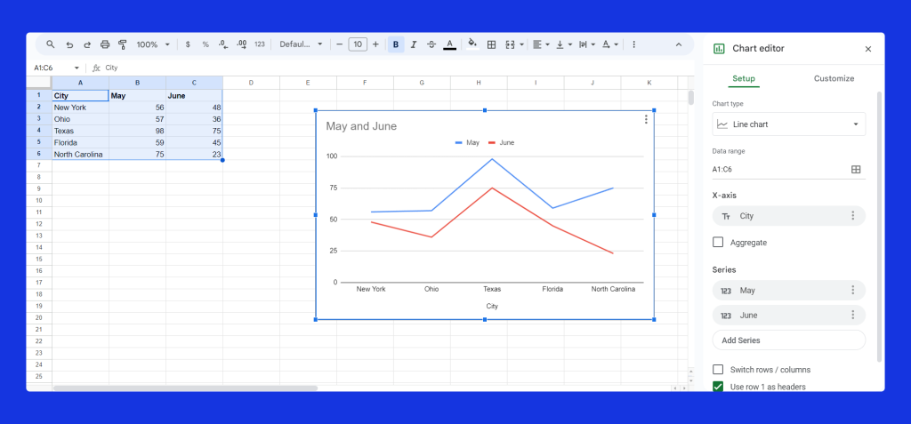
if you are using Google Sheets, it will automatically create the double y-axis chart and open the chart editor on the right side of the screen.
4. Choose Chart Types:
- In the chart creation dialog, specify the chart types for each set of Y-axis values. Typically, one set of data is represented by bars or lines, while the other is represented by lines.
- Assign one Y-axis to the left side and the other to the right side.
5. Customize Your Chart:
- Use chart customization options to adjust the appearance and labels of your double Y-axis graph. You can modify colors, add titles, and format axis labels.
6. Preview and Adjust:
- Review the double Y-axis graph to ensure that it effectively visualizes your data. Pay attention to how the two datasets interact and whether the scales are appropriate.
7. Save Your Chart:
- Once you’re satisfied with the double Y-axis graph, save it in your spreadsheet or presentation document.
Interpreting Double Y-Axis Graphs
When interpreting double Y-axis graphs, consider the following key points:
- Axis Scales: Observe the scales on both Y-axes to understand the magnitude of each dataset. Ensure that the scales are appropriately chosen for clarity.
- Relationships: Analyze how changes in one dataset correspond to changes in the other. Consider if there is a causal relationship, correlation, or other patterns.
- Annotations: Utilize chart annotations, labels, or legends to clarify which dataset corresponds to each Y-axis.
Real-Life Examples of Using Double Y-axis Graph
1. Sales and Marketing Spend
Imagine you’re a marketing manager analyzing your company’s performance. You want to understand the relationship between your monthly marketing spending (in dollars) and the number of new customers acquired each month. Here’s how a double Y-axis graph can help:
- Left Y-axis (Primary Axis): Represents the marketing spend, showing peaks and valleys in your spending over time.
- Right Y-axis (Secondary Axis): Represents the number of new customers, helping you see if marketing spending correlates with customer acquisition.
This dual-axis graph allows you to visualize whether increased spending directly leads to more customers and if there’s a lag effect in customer acquisition.

2. Temperature and Energy Consumption
Suppose you manage a building’s energy consumption. You want to analyze how outside temperature fluctuations impact your energy usage. Here’s how a double Y-axis graph can shed light on this relationship:
- Left Y-axis (Primary Axis): Represents the daily average temperature (in degrees Fahrenheit or Celsius).
- Right Y-axis (Secondary Axis): Represents daily energy consumption (in kilowatt-hours or other energy units).
This dual-axis graph enables you to correlate temperature spikes or drops with corresponding energy spikes, helping you identify patterns for energy-efficient temperature management.
3. Stock Prices and Trading Volume
As an investor, you’re interested in the performance of a specific stock. You want to analyze how stock prices and trading volume are related. A double Y-axis graph can assist:
- Left Y-axis (Primary Axis): Represents the stock price (in dollars), showing the stock’s daily price fluctuations.
- Right Y-axis (Secondary Axis): Represents trading volume (in shares), illustrating daily trading activity.
This dual-axis graph allows you to visualize whether increased trading volume accompanies significant price movements, helping you make informed trading decisions.
Conclusion
Double Y-axis graphs are valuable tools for visualizing and comparing datasets with differing units or scales. Whether you’re analyzing financial data, scientific measurements, or performance metrics, these graphs provide a concise and informative way to convey insights and make data-driven decisions.


