
Want to learn how to make a scatter plot in Excel with sets of data? You are at the right place.
Scatter plots are a great way to visualize relationships between two different sets of numeric data. By plotting two data sets together on a scatter plot, you can gain insights into how the data interacts.
In this post, we’ll walk through the process of making a scatter plot in Excel using two columns of data.
What is a Scatter Plot?
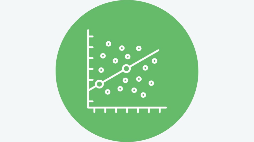
A scatter plot (also known as a scatter chart and scatter graph) is a graph that displays dots as data points representing two different variables. Each data point shows the intersection of values for the x and y variables.
Scatter plots are especially useful for identifying correlations between variables. The closer the data points cluster together, the stronger the correlation between the two variables.
What is a Scatter Plot used for?
While versatile, scatter plots are commonly used in the following scenarios:
1. Exploring Correlations
If you need to determine whether and to what extent two variables are related, a scatter plot is an ideal visualization. It provides an immediate visual indicator of correlation strength and direction.
2. Studying Distributions
Scatter plots give a clear picture of how data points are distributed across the x and y axes. Seeing the data distributions is crucial for segmentation, identifying patterns, and statistical modeling.
3. Comparing Data Sets
Plotting different data sets on the same scatter plot makes it easy to visually compare relationships and distributions. Colors and shapes can differentiate data sets.
4. Presenting Scientific Data
Scatter plots are ubiquitous in scientific research papers and presentations, as they clearly show relationships and patterns in quantitative data. Science relies heavily on scatter plots.
Step-by-Step Guide to Creating a Dual Dataset Scatter Plot
Here is an easy step-by-step guide on how to make a scatter plot with two sets of data in Excel. To follow along, you should open the Excel sheet with the data on your computer or you can open an online Excel sheet and paste data there.
- Enter your data into two columns in Excel. The first column should contain the values of the independent variable, and the second column should contain the values of the dependent variable.
- Select the two columns of data.
- Go to the Insert tab and click on the Scatter chart icon.
- Select a scatter plot template.
- Click on the OK button.
- The scatter plot will be inserted into your worksheet.
- To add the second set of data to the scatter plot, follow these steps:
- Click on the Chart Design tab.
- Click on the Select Data button.
- In the Select Data dialog box, click on the Add button.
- In the Series dialog box, select the range of cells for the second set of data.
- Click on the OK button.
- Click on the OK button again.
And that’s it, you now have a scatter plot with two data sets! The key is entering each dataset separately and then adding the second set to the existing chart.
Also Read: How to make Sunburst Chart in Excel
Tips for Effective Dual Data Set Scatter Plots
To get the most out of comparing two data sets on the same scatter plot, keep these tips in mind:
- Use different colors for each data set
- Add descriptive legend entries to differentiate data sets
- Show trendlines for each dataset to make correlations clear
- Adjust axis scales to spread out overlapping data points
- Eliminate unnecessary clutter that obscures insights
With a well-structured and customized dual dataset scatter plot in Excel, you can unlock a whole new level of data comparison and insight! The side-by-side view makes similarities, differences, and interplay obvious.
Real-World Examples of Scatter Plot Applications
Here are some examples of scatter plots providing pivotal insights in various domains:
I. Business – Marketing Spend vs. Revenue
A scatter plot with marketing spend on the x-axis and revenue on the y-axis quickly shows if increased marketing budgets correspond to higher revenues. This informs optimal marketing budget allocation.
II. Meteorology – Temperature vs. Precipitation
Plotting temperature against precipitation rates can reveal relationships between these variables. This helps meteorologists develop predictive weather models.
III. Healthcare – Drug Dosage vs. Effectiveness
Scatter plotting drug dosage levels against positive health outcomes elucidates optimal dosing regimens for medical treatments.
IV. Sports – Height vs. Rebounding
A scatter plot with player height on the x-axis and rebounds per game on the y-axis displays whether taller players tend to excel at rebounding. Coaches use these insights for player evaluations.
V. Social Sciences – Income vs. Happiness
Researchers can plot income against happiness ratings to study the relationship between money and subjective well-being.
The Power of Scatter Plots
In today’s data-driven world, scatter plots are indispensable tools for gaining insights into the intricate relationships between variables that shape decisions across industries. In Excel, scatter plots are simple to create yet profoundly empower analytical capabilities. By artfully employing scatter plots, analysts of all stripes can expose hidden gems within their data. Each data point holds a story waiting to be uncovered.


