
In the dynamic world of data analysis, harnessing the potential of visual representation has become paramount for businesses seeking a competitive edge. Excel, the versatile tool embraced by many, offers a powerful means of presenting complex information with clarity and impact through its charts and graphs.
This article will reveal cool Excel charts and graphs.
| ☑Quick Answer |
| Cool Excel charts and graphs offer excellent, dynamic visualizations that make data more understandable and engaging. They include customizable elements and interactive features that enhance aesthetics without complicating data presentations. |
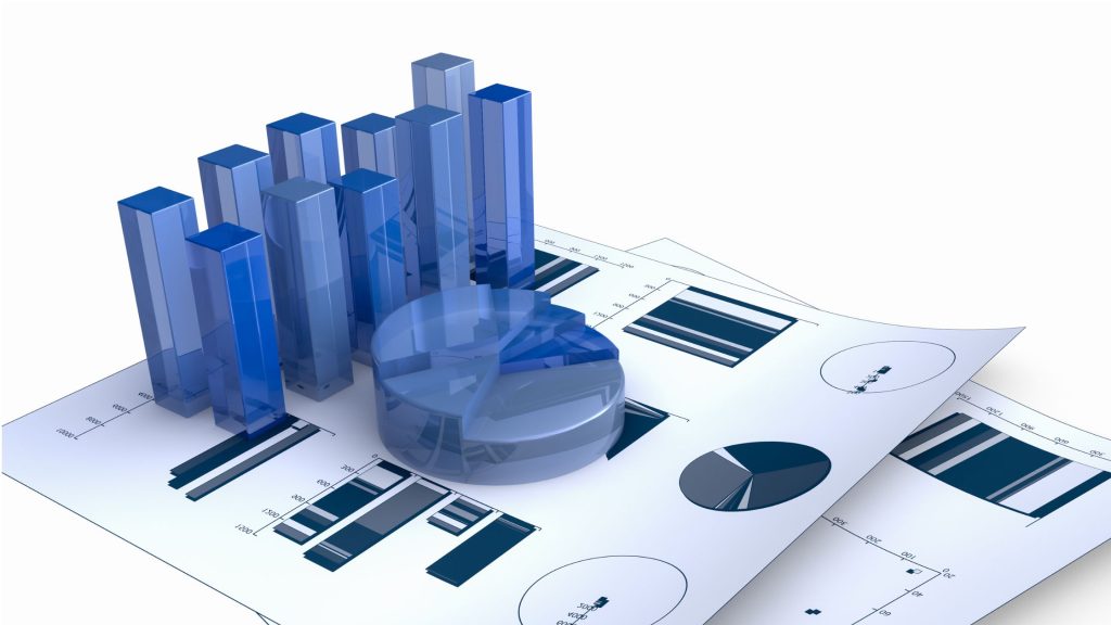
What is a Graph or Chart in Excel?
A chart in Excel is a compelling diagram or picture that allows you to display data in a visually appealing manner. By transforming raw numbers into easily digestible visuals, charts enable your audience to grasp essential insights effortlessly.
On the other hand, an Excel graph is a powerful visual representation that shines the spotlight on your raw data, making it easier to discern comparisons, trends, and patterns over time. The graphical presentation enhances data comprehension, facilitating more informed decision-making for business owners like you.
The Cool Excel Charts and Graphs You Should Know
From uncovering hidden patterns to tracking progress over time, these eight exceptional Excel charts add depth and clarity to your data analysis.
Without wasting time, here are some cool Excel charts and graphs you should consider whenever you want to visualize data:
1. Unraveling Connections with Sankey Diagrams
In the realm of metrics visualization, the Sankey Diagram stands as a powerful tool. This captivating chart elegantly showcases the flow of information, be it customer journeys, energy distribution, or revenue streams.
By representing the flow’s quantity through varying heights of flows, the Sankey Diagram empowers business owners to identify the most influential contributors, facilitating valuable insights.
2. Illuminating Relationships with Scatter Plots
Embark on a journey of discovery with the Scatter Plot Chart, which employs Cartesian coordinates to present diverse values in the form of dots. Easily glean vital insights by observing data points along the x and y-axes and identifying cause-and-effect relationships between essential variables.
3. Prioritizing with Pareto Charts
Meet the Pareto Chart, a harmonious blend of a bar and line graph, renowned for its effectiveness in prioritization. Arrange individual values in descending order, either horizontally or vertically. This cool chart helps analyze the frequency of challenges and identify the key factors that significantly impact any given scenario.
4. Gauging Sentiments with Likert Scale Charts
For business owners seeking to analyze product or service feedback, the Likert Scale Chart is an invaluable asset. By capturing respondents’ levels of agreement or disagreement on an even scale, this chart brings survey data to life, providing easy-to-read visualizations of customer satisfaction and preferences.
5. Captivating Time-Based Insights with Slope Charts
Delve into the world of time-based data exploration with the Slope Chart, a concise yet powerful line chart. Observe changes over time, compare crucial key performance indicators (KPIs), and gain insightful takeaways from even the most complex data sets.
6. Tracking Sentiment Trends with Bar Graphs
Witness the elegance of the Sentiment Trend Chart, where data changes reveal themselves in positive and negative responses. Unlock the ability to forecast future outcomes by analyzing past trends, gauging customer satisfaction levels, and identifying areas for improvement.
7. Visualizing Progress with Creative Progress Bar Charts
Experience a unique visualization with the Progress Bar Chart, showcasing progress over time for activities or projects. This creative Excel chart empowers business owners to prioritize tasks, monitor project milestones, and view multiple project results side by side.
8. Decoding Financials with Waterfall Charts
For financial analysis, the Waterfall Chart stands as an indispensable asset. Track the impact of positive and negative values on metrics like revenue and income with distinctive colors for easy differentiation. Unravel the dynamics of financial changes, from initial to final values, through floating columns.
Why Are Excel Charts and Graphs Indispensable in Modern Business?

Embracing data visualization through charts and graphs can be a game-changer for entrepreneurs. By visually representing your business data, you gain a deeper understanding of critical aspects such as customer behavior, revenue streams, and overall progress.
As you navigate the vast landscape of Excel, you’ll discover a wide array of basic charts and graphs readily available in its comprehensive library. There’s no need for third-party add-ins to access these powerful features.
From fundamental yet impactful pie charts to versatile bar graphs and informative line graphs, Excel equips you with all the essential tools to present your data with finesse.
However, in today’s data-driven era, the demand for more sophisticated data visualization has grown exponentially. To stay ahead of the curve, it’s time to elevate your charting game and unlock a world of stunning visualizations.
As businesses continue to generate vast amounts of data, the ability to extract meaningful patterns and trends becomes a crucial differentiator.
That is why it is now crucial to empower yourself with the knowledge and creativity to craft compelling narratives that captivate your audience, turning complex data into a source of inspiration and actionable strategies.
FAQs
- What is the best way to highlight specific data points on an Excel chart?
To highlight specific data points on an Excel chart, use the following:
- Data labels
- Data markers
- Annotations
- Color
- Secondary axis
- Trendlines
- Can I combine two different chart types into one chart in Excel?
Yes, you can produce combination charts in Excel by combining two or even more chart types to visualize different datasets on the same chart.
Conclusion
Incorporating exceptional Excel charts and graphs into your data visualization repertoire will transform how you analyze and interpret information, unlocking invaluable insights for your business. Make your data visually engaging, understandable, and actionable with the artistry of these diverse graphs and charts.


