Interpreting graphs and charts is a vital skill in today’s data-driven global village. Whether you’re a professional or just another person interested in making informed decisions, understanding visual or pictorial data representations is highly crucial.
Charts and graphs offer powerful but concise ways of conveying complex information. They enable you to readily identify patterns, correlations, and trends that help fuel decision-making.
This article explores how to interpret graphs and charts, including a few strategies and key techniques that will help you unlock valuable insights to make sense of the data presented before you.
| ☑Quick Answer |
| To interpret graphs and charts, you should first analyze the trends, patterns, trends, and correlations or relationships presented in the data. Then consider several variables, labels, axes, and any provided context to fully understand the information conveyed. |
The Importance of Graphs and Charts in Data Visualization

Charts and graphs play vital roles in data visualization. They visually represent highly complex data or information in a concise and clear manner in various fields such as social sciences, economics, and science. They also help you identify trends, patterns, and relationships in the presented data.
Without graphs and charts, understanding and effectively communicating insights obtained via in-depth research will be challenging. That is why learning how to interpret graphs and charts is vital for making informed decisions.
Interpreting Graphs and Charts
When it comes to interpreting graphs and charts, you need to consider several key aspects, which are as follows:
1. Read the Axes
Understand the units and scales: Pay close attention to the values printed on the axes and their corresponding units. This makes it easier to comprehend the magnitude of the presented data and the measurement scale.
Identify dependent and independent variables: Determine the dependent variable (i.e., the variable under observation or measurement) and the independent variable (i.e., the variable being controlled or manipulated). Understanding the difference helps in the interpretation of cause-and-effect relationships.
2. Analyze Values and Data Points
Note exact values: Take note of specific values or data points presented on the chart or graph. This is useful for making precise calculations or comparisons.
Compare and contrast data points: Check for differences and similarities between different values or data points. This provides in-depth insights into trends, relationships, or patterns in the data.
3. Observe Patterns and Trends
Identify downward/upward trends: Are the data points decreasing or increasing across different categories or over time? Determine this, and you will understand the overall direction of the data.
Detect seasonal or cyclic patterns: Check for cycles or recurring patterns within the data. This is crucial, especially in time series graphs. Pinpointing these trends or patterns provides solid information about periodic trends or seasonal variations.
4. Make Comparisons
Compare different groups/categories: Compare this data across the different groups or categories represented on the chart or graph. This gives you a deeper understanding of the differences or similarities in the data between these groups/categories.
Analyze magnitude for significant differences: Evaluate the magnitude or size of differences between values. This analysis helps evaluate the significance of variations and their overall impact on the interpretation of the data.
5. Interpret Percentage and Proportions

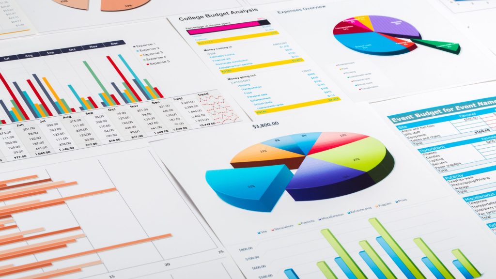
Determine relative sizes in pie charts: Analyze the size of every slice within a pie chart to understand the percentage or proportion it represents in relation to the whole visual.
Understand percentage distributions: Interpret the proportion or percentage values in stacked bar graphs or bar graphs to understand the distribution of data across several groups/categories.
6. Assess Correlations
Evaluate the relationship between variables in scatter plots: Carefully study the scatter plot to pinpoint the relationships between 2 variables.
Check for patterns that indicate zero correlation (i.e., no apparent association), negative correlation (i.e., one variable decreases while the other increases), and positive correction (i.e., both variables decrease or increase together).
Pinpoint negative, positive, or zero correlation: Determine the strength and direction of the association between variables within scatter plots. This information helps you understand how changes in one variable correspond to changes in another.
Frequently Asked Questions (FAQs)
1. What is the best way to make sure graphs are easy to interpret?
Using color coding is the best way to ensure your charts and graphs are easy to interpret. This is because colors are highly attractive, and the human brain interprets colors differently. Colors also help show your audience other variables.
2. What are the 3 ways of interpreting graphs?
The best 3 ways of interpreting graphs include reading the title, reading the labels, and looking at the key. Then, you may study the graph to understand what it shows.
Conclusion
Understanding how to interpret graphs and charts is an essential skill for effectively conveying and analyzing data. By following a systematic approach of examining titles, patterns, trends, and correlations, one can gather valuable insights from visual representations.
Identifying trends, patterns, and outliers enables informed decision-making in various fields, from business and finance to academia and science. Moreover, recognizing the potential biases and limitations of graphs and charts ensures a cautious interpretation.


