
Charts and graphs are visual representations of data that provide a concise and clear way to communicate information. They are widely used in various fields such as business, science, education, and journalism to present data in a more understandable and engaging manner.
Different types of charts and graphs are employed based on the type of data being represented and the purpose of the presentation. In this article, we will explore some of the most common types of charts and graphs and their applications.
Types of Charts and Graphs
1. Line Chart
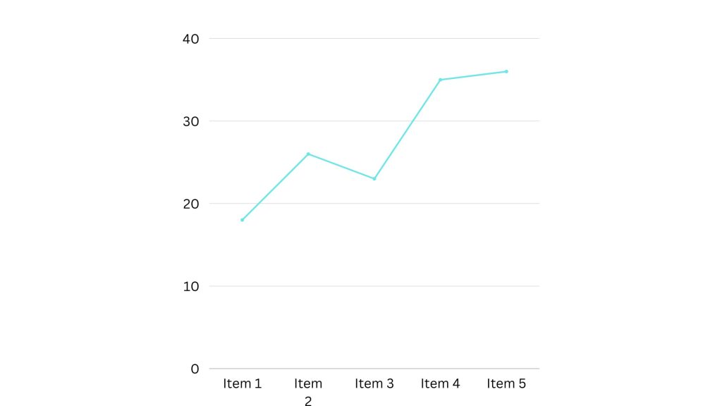
A line chart is a basic type of chart that depicts data points connected by straight lines. It is used to show trends or changes in data over time. Line charts are particularly useful for illustrating continuous data such as stock prices, temperature variations, or population growth. The x-axis represents time, while the y-axis represents the measured quantity. Line charts can have multiple lines, enabling comparisons between different data series.
Best Use Scenarios for These Types of Graphs
Users can track changes over both short and long periods using line graphs. This makes these graphs useful for spotting small changes. You can compare changes for multiple groups over the same time period using line graphs. They are useful for determining how various groups interact with one another.
Companies can use this graph to compare the yearly sales rates of various goods or services. Also, companies can use these charts to determine the effectiveness of the service channel. An illustration would be a line graph showing the number of chats or emails your staff responds to each month.
2. Bar Chart
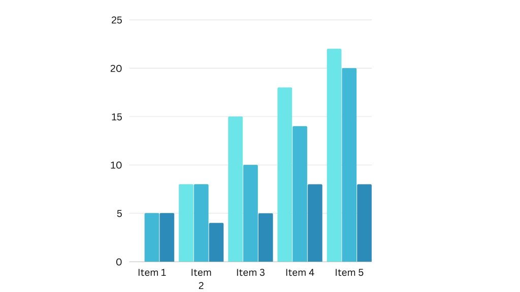
A bar chart, also known as a bar graph, uses rectangular bars to represent data. It is used to compare discrete categories or groups. The magnitude or extent of each bar corresponds to the quantity or value being depicted. Bar charts are effective in showing comparisons between different items, such as sales figures for different products, population statistics for different cities, or survey results for different options.
Best Use Scenarios for These Graph Types
You can use bar graphs to compare data between groups or to monitor changes over time. When there are significant changes or when comparing one group to other groups, bar graphs are most helpful.
A bar graph also makes it simple to see which group of data is the most common. For example, at the beginning of the epidemic, online businesses experienced a significant increase in traffic. So, if you want to check monthly traffic for an internet business, a bar graph will help you see the increase.
Other use cases
- Product comparisons.
- Product usage.
- Category comparisons.
- Marketing monthly or yearly traffic
- Marketing conversions.
Still on charts and graphs let’s take a look at another widely used chart.
3. Pie Chart
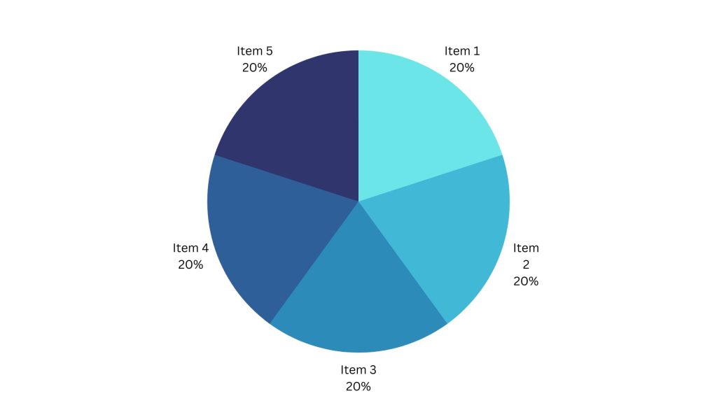
A pie chart is a circular graph divided into sectors that represent different categories or proportions of a whole. The magnitude of each sector corresponds proportionally to the quantity it represents.
Pie charts are used to display relative proportions or percentages. They are suitable for displaying data with a limited number of categories, such as market share distribution, budget allocation, or demographic composition.
Best Use Scenarios for This Type of Chart
Pie charts make it simple to see a piece in relation to the whole, hence they are useful for displaying:
- Customer identities in relation to all customers.
- In relation to total product sales, revenue from your most popular products or product types.
- Percentage of total profit from various retail locations.
4. Histogram
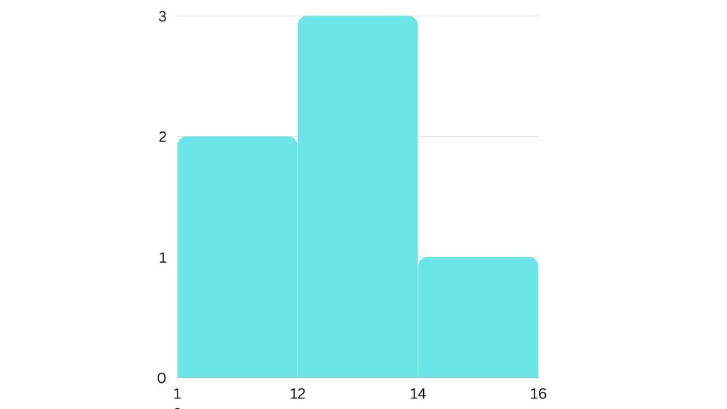
A histogram is a visual depiction of the distribution of frequencies. It consists of adjacent rectangular bars where the area of each bar corresponds to the frequency of data within a specific range.
Histograms are used to visualize the distribution of continuous or discrete data. They are commonly employed in statistics to analyze data sets and identify patterns, such as the distribution of heights, ages, or exam scores.
5. Scatter Plot
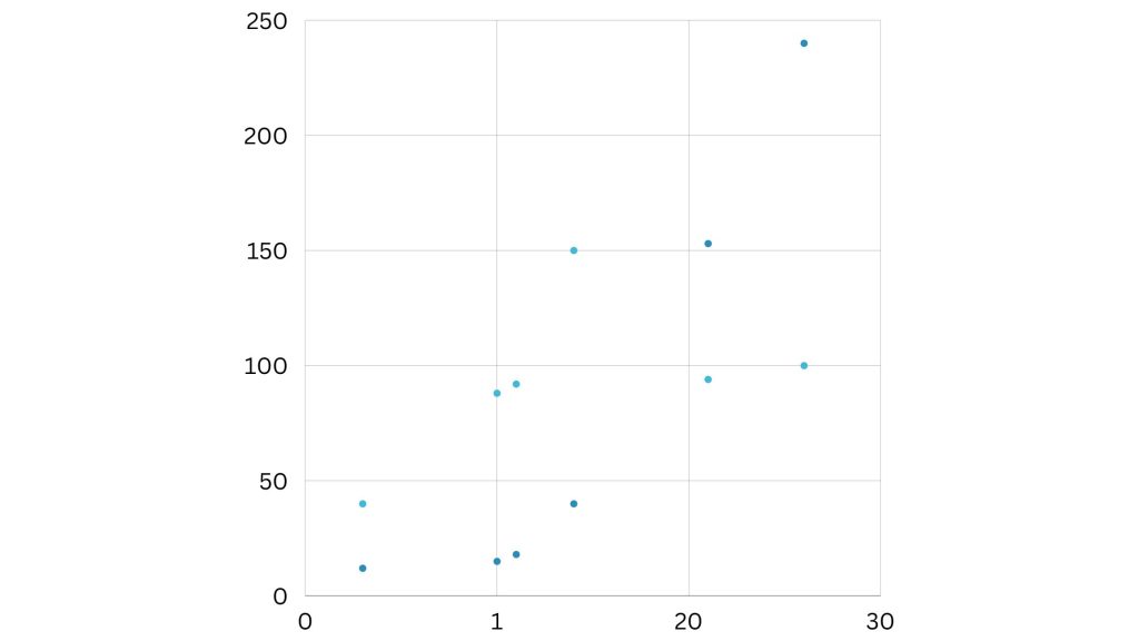
A scatter plot uses Cartesian coordinates to display values for two variables as individual data points. Each point represents the intersection of a value on the x-axis and a value on the y-axis. Scatter plots are useful for identifying relationships or correlations between variables. Companies often employ it in scientific research, social sciences, or market analysis to investigate how changes in one variable affect another.
Best Use Scenarios for These Types of Charts
Scatter plots are useful when there is too much data to rapidly identify a trend. They work best when used to illustrate connections between two sizable data sets. This graph illustrates how customer satisfaction and response time are related in the aforementioned case.
It is simple to compare two data sets using this type of graph. Use cases could involve:
- Manufacturing output and employment.
- Inflation and retail sales.
- The number of visitors and the temperature outside.
- Tax laws and sales growth.
Choose two data sets that have an existing positive or negative relationship. However, this type of graph can also make it simpler to notice data that deviates from regular patterns.
6. Area Chart
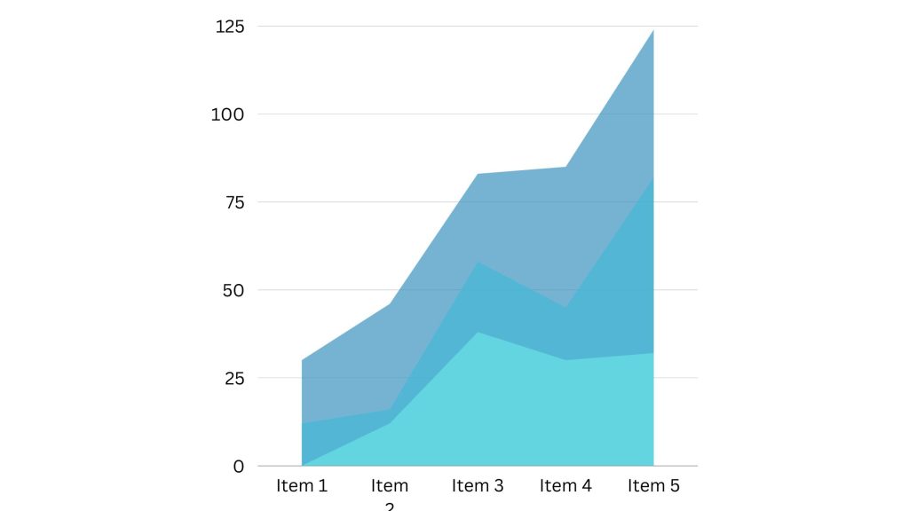
An area chart is similar to a line chart but with the area below the line filled with color or patterns. It is used to depict the cumulative total of multiple data series over time. Area charts are helpful for illustrating the composition of a whole and the contribution of each category to the total. Businesses can use it often to represent stock market trends, population growth, or budget expenditure over time.
Best Use Scenarios for These Types of Charts
Area charts are useful for displaying changes over time. They perform best for large disparities between data sets and aid in the visualization of large trends. A line chart may illustrate that there are more subscribers than marketing-qualified leads. However, this area chart illustrates how many subscribers there are in comparison to any other group.
The size of a group and how groupings relate to one another are more visually relevant in these charts than data changes over time. Area graphs can assist your company in the following ways:
- Visualize the most popular product categories or products within a category.
- Display key performance indicator (KPI) objectives vs outcomes.
- Recognize and analyze industry trends.
7. Bubble Chart
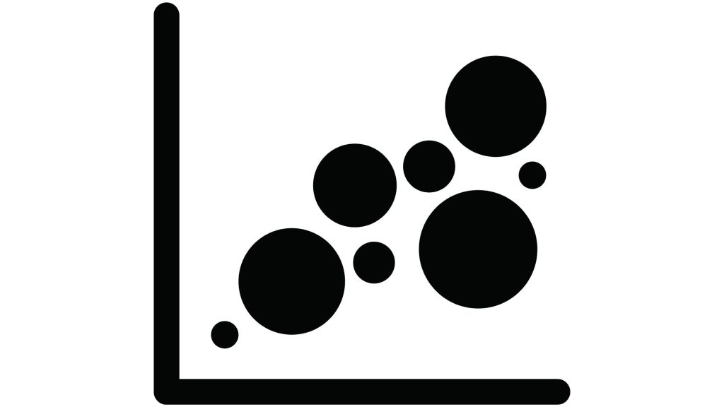
A bubble chart is a modified version of a scatter plot in which data points are substituted with bubbles of diverse sizes. The x and y-axis represent two variables, while the size of each bubble represents a third variable. Bubble charts are effective in displaying complex data sets with three dimensions.
They are often used in finance, economics, and social sciences to visualize relationships between variables.
Best Use Scenarios for These Types of Charts
Bubble charts are handy for observing the rise and fall of trends throughout time. It also allows you to add another option while attempting to understand relationships between several segments or groups.
For example, if you wish to launch a new product, this chart can help you rapidly assess the cost, risk, and value of your new product. This can assist you in concentrating your efforts on a low-risk new product with a high potential return.
Bubble charts can also be used for:
- Top monthly and location sales.
- Surveys of customer satisfaction.
- Tracking store performance.
- Examining marketing campaigns.
8. Gantt Chart

A Gantt chart is a widely utilized horizontal bar chart in project management, employed to visually represent project schedules. It shows the start and end dates of different project tasks or activities as horizontal bars. Gantt charts provide a visual representation of project timelines, dependencies, and progress. They are valuable tools for planning, coordinating, and tracking project activities.
You can use this chart type to:
- Divide projects into tasks.
- Keep track of when the tasks begin and end.
- Schedule crucial meetings, events, and announcements.
- Assign responsibilities to members of the team and individuals.
Best Use Scenarios for These Types of Charts
Gantt charts are ideal for analyzing, road mapping, and tracking progress over time. The Gantt chart assists project management teams in developing long-term strategies, from the vision and strategy to the seed funding round.
What’s the best part? You can gather the stakeholders, project team, and managers in one place. Gantt charts can be used for a variety of tasks, including:
- Keeping track of personnel records as a human resource.
- Keeping track of sales leads during the sales process.
- Construction work can be planned and tracked.
9. Radar Chart
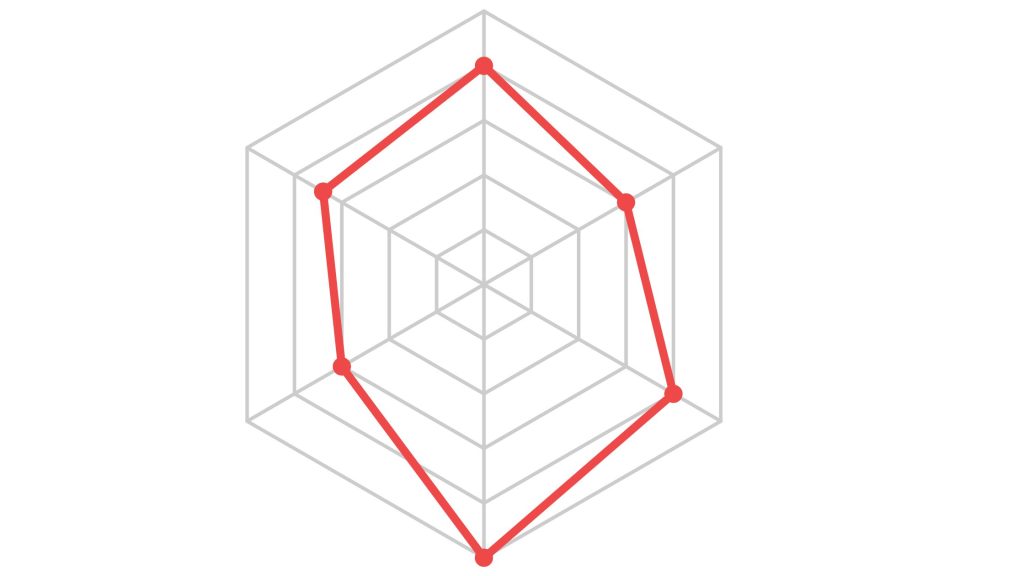
A radar chart, alternatively known as a spider chart or star plot, is a graphical portrayal of multivariate data that presents itself as a two-dimensional chart containing multiple axes. Each axis corresponds to a distinct variable, and this links the data points to create a shape. Radar charts are beneficial for comparing various variables across diverse categories.
They are commonly used in sports, market research, and performance evaluations. These are just a few of the many types of charts and graphs available for visualizing data. Choosing the most appropriate chart or graph depends on the nature of the data and the objective of the analysis.
By utilizing the right visual representation, data can be presented in a meaningful and impactful way, enhancing understanding and facilitating informed decision-making.
READ ALSO:
- How to Print Gridlines in Excel Online
- How to Import Data into Excel Online
- How to get Excel Certified Online
- How to Access Excel Online
Frequently Asked Questions
When should I use a Line Chart?
Line charts are used to show trends or changes in data over time. They are particularly suitable for representing continuous data such as stock prices, temperature variations, or population growth.
In what Situations is a Bar Chart Most Effective?
Bar charts are used to compare discrete categories or groups. They are useful for illustrating comparisons between different items, such as sales figures for different products, population statistics for different cities, or survey results for different options.
What is the Aim of using a Pie Chart?
Pie charts are used to display relative proportions or percentages of a whole. They are suitable for representing data with a limited number of categories, such as market share distribution, budget allocation, or demographic composition.
When should I use a Histogram?
Histograms are used to visualize the distribution of continuous or discrete data. They are effective in analyzing data sets and identifying patterns, such as the distribution of heights, ages, or exam scores.
What is the Purpose of a Scatter Plot?
Scatter plots are used to investigate relationships or correlations between variables. They are helpful in scientific research, social sciences, or market analysis to understand how changes in one variable affect another.
When is an Area Chart appropriate to Use?
Businesses can use Area charts to depict the cumulative total of multiple data series over time. They are useful for illustrating the composition of a whole and the contribution of each category to the total.
What is the Significance of a Bubble Chart?
You can use Bubble charts to display complex data sets with three dimensions. They show relationships between variables by representing them as bubbles with varying sizes, in addition to the x and y-axis coordinates.
What is the Purpose of a Gantt Chart?
Businesses can use Gantt charts in project management to illustrate project schedules, tasks, and progress over time. They provide a visual representation of project timelines, dependencies, and activities.
Conclusion
Picking the right graphs and charts for your data visualization is key, as there is a wide range of options. When used in the right way, it can help make your reports and presentations professional and easy to understand. Remember to choose the most appropriate charts or graphs based on your data and the specific insights you want to convey.


