In the ever-expanding landscape of data visualization, the stacked column chart stands tall as a versatile and dynamic tool. When the need arises to compare and contrast two sets of data, a stacked column chart shines as a means to convey complex information with clarity and precision. In this comprehensive guide, we will learn about what is a stacked column chart with two sets of data and how to make one. So, let’s get started.
Understanding Stacked Column Charts
Before we look into the details of working with dual data sets, let’s build a solid foundation by understanding the core components of stacked column charts:
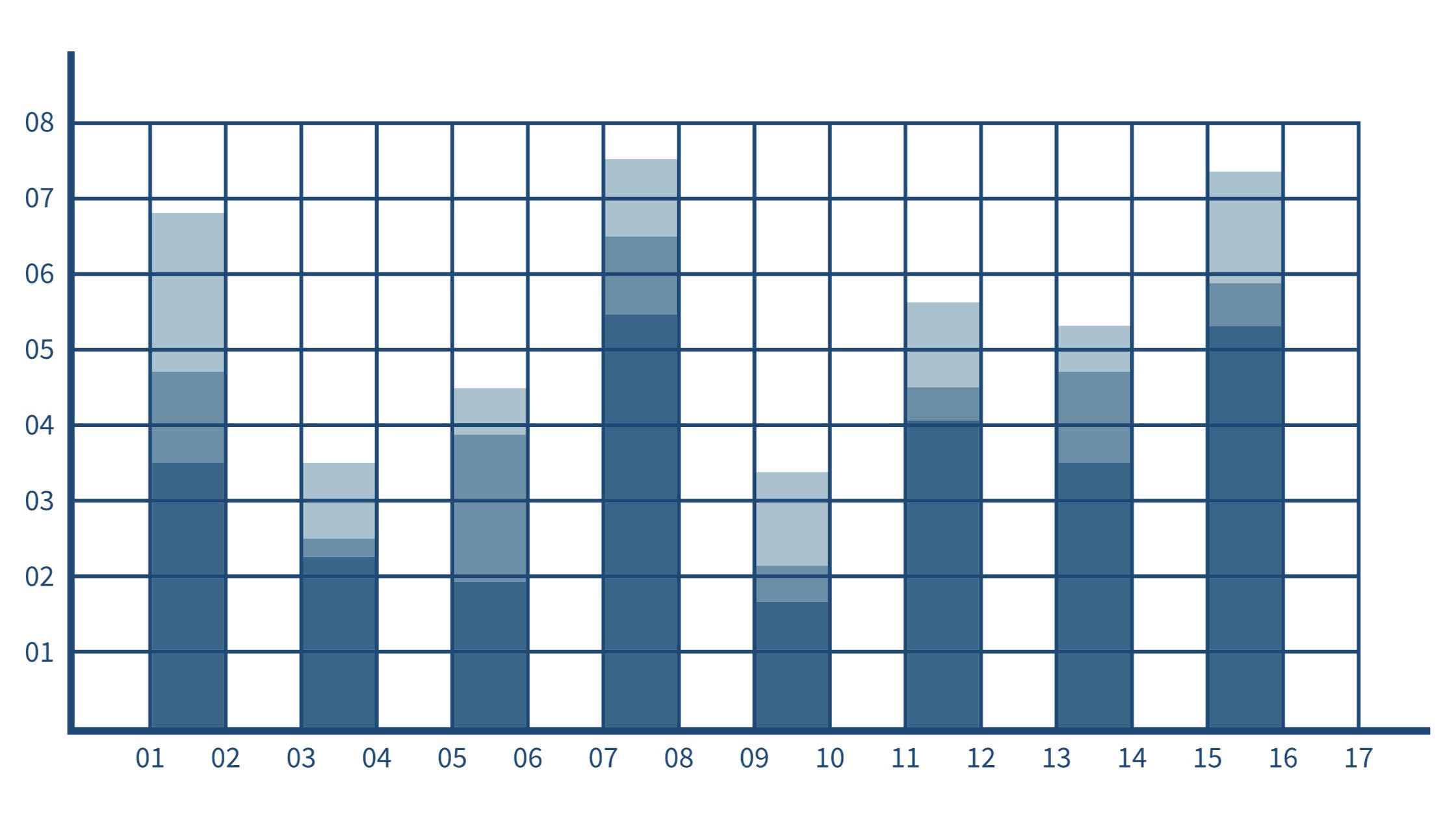
1. Vertical Columns:
Stacked column charts are characterized by their vertical columns, each representing distinct categories or groups of data.
2. Segments Within Columns:
Within these columns, you’ll find segments, each of which represents a specific data point or subcategory related to the overarching category.
3. Stacking for Comparison:
The defining feature of these charts is the stacking of these segments on top of each other within the same column. This stacking arrangement facilitates a direct and efficient comparison between different data sets or subcategories.
Stacked Column Charts with Two Data Sets
When confronted with the challenge of working with two data sets, stacked column charts shine as a means to bring order and clarity to the complexity of the data. Here’s how they function:
- Dual Data Stacking: In a stacked column chart designed for two data sets, each column is thoughtfully divided into two segments, one dedicated to each of the two data sets.
- Direct Side-by-Side Comparison: This arrangement allows for an immediate, side-by-side comparison of the two data sets within each category or group. The visual proximity of the segments reinforces the comparison, aiding in quick and accurate analysis.
- Color Coding for Clarity: To ensure that the comparison is readily apparent, the use of color is a powerful tool. Each data set can be assigned a distinct color scheme, making it visually clear and enhancing overall understanding.
Applications and Use Cases
The versatility of stacked column charts with two data sets lends itself to a multitude of real-world scenarios and applications:
- Sales Analysis: In the realm of sales, these charts enable a comprehensive comparison of actual sales figures with target sales. Alternatively, they allow for an assessment of the performance of two products or services within different regions or time periods.
- Budget vs. Actual: For financial professionals, comparing budgeted vs. actual expenses is a common and critical task. Stacked column charts effectively visualize this data, aiding in financial planning and control.
- Survey Results: Market researchers and survey analysts find stacked column charts invaluable when dealing with survey responses. These charts make it easy to compare the responses of two different demographics or sets of questions, shedding light on critical insights.
Creating Stacked Column Charts with Two Data Sets
To harness the power of these insightful charts, follow these detailed steps:
- Data Preparation: Begin with meticulous data organization. Make sure that you separate your data into two distinct sets and that it’s clean, accurate, and ready for analysis.
- Select the Right Software: Choose data visualization software or tools that offer the capability to create stacked column charts with two data sets. Many popular spreadsheet applications and specialized data visualization tools support this chart type.
- Select Data and Chart Type: With your data sets in order, highlight them and select the stacked column chart with two data set options within your chosen software.
- Customize and Label: Personalize your chart to enhance clarity and visual appeal. This includes adding colors, labels, and legends. Thoughtful customization can significantly improve the chart’s ability to convey complex information effectively.
- Interpret and Share: The final step is to interpret the data presented by your chart and share it with your intended audience. Ensure that the comparisons are evident and easily understandable. Use clear labels and contextual information to assist viewers in making sense of the data.
Conclusion
In the ever-evolving landscape of data analysis and visualization, stacked column charts with two data sets emerge as powerful tools. They help to unlock insights, drive informed decisions, and effectively convey complex data narratives. By mastering the creation and interpretation of these charts, you empower yourself to navigate the data-rich terrain.


