Surveys provide invaluable first-hand data on customer opinions. But raw survey results alone don’t tell the full story. Proper analysis and an insightful presentation transform survey data into compelling insights. Therefore, to derive actionable insights, you need to analyze the data and present it effectively through your survey analysis report.
This article will walk through creating an effective survey analysis report. You’ll learn:
- Key elements to include like objectives, methodology, data visualizations, conclusions, and recommendations.
- Visualization best practices to present data clearly.
- Step-by-step breakdown of all elements of a Survey Analysis Report through an example.
Understanding the Essentials of a Survey Analysis Report
Before we dive into the example, let’s establish a clear understanding of what a survey analysis report should encompass:
1. Define the Survey Goals and Methodology
The survey analysis report should begin by recapping the goals and methodology. Remind readers why the survey was conducted and how you gathered the data.
Clearly state the purpose such as:
- Evaluate customer satisfaction
- Assess brand awareness
- Gauge product demand
Explain how and when the survey was administered. Share details like:
- Survey length – e.g. 20 questions
- Mode – online, email, phone, in-person
- Dates fielded – e.g. July 1 – July 15, 2022
- Number and source of respondents
This context helps readers interpret the findings.
2. Present Key Data Insights Up Front
Don’t bury the most important survey findings. Highlight key takeaways upfront through an executive summary or overview.
Use data visualizations like charts to showcase crucial insights. For example, include:
- A satisfaction score breakdown showing percentages of satisfied, neutral, and dissatisfied respondents.
- A column chart of the most frequent survey responses.
- A comparison chart on satisfaction ratings across customer segments.
Summarize the most actionable findings. This executive view prepares readers to dive into the analysis details.
3. Analyze Closed-Ended Survey Questions

Closed-ended questions with set response options are easier to quantify and analyze. Review response rates for each option.
For rating questions like satisfaction scales, calculate the weighted average. Compare averages across customer groups with charts.
Use frequency tables to show counts and percentages when choosing each option. Filter by respondent segments for deeper analysis.
Statistical testing can reveal significant differences in responses across segments. Include relevant statistical analysis to back conclusions.
4. Uncover Themes in Open-Ended Feedback
For open-ended questions, use qualitative analysis to uncover themes. Group similar ideas and comments into categories using coding.
Text analysis tools can automatically detect top themes and sentiments in open-ended feedback. Include keyword summaries or shared sample quotes.
Watch for trends and correlations, like dissatisfied customers frequently mentioning certain issues.
Compare themes across customer segments, such as complaints about technical issues primarily coming from older respondents.
Prioritize addressing feedback from key customer groups, even if not the most frequent.
5. Put Survey Findings in Context
Don’t just present the survey data at face value. Provide context around findings to make them meaningful.
Benchmark results against competitors or industry standards. Show if ratings and metrics are above or below benchmarks.
Point out statistically significant differences between segments.
Compare results to previous surveys to determine trends over time.
Link findings to broader organizational goals and business metrics. Demonstrate their real-world impact.
Thorough analysis and commentary transform raw survey data into insightful revelations.
6. Present Visually Appealing Data Visualizations
Replace dense survey data tables with appealing charts and graphs. Well-designed visuals make findings more accessible and memorable.
Use simple, easily interpreted charts like bar and column graphs to show response distributions, averages, and comparisons. Reserve complex charts for technical presentations.
Choose colors, layouts, and styles that fit your organization’s brand for professional data visuals.
Follow best practices for effective visuals, like consistent scales, legible text, clear labels, and concise chart titles.
Let the data shine by keeping visuals simple. Avoid over-embellishment and clutter.
7. Provide Conclusions and Recommendations
Wrap up the survey analysis report by summarizing conclusions and providing recommendations.
Summarize the key takeaways from the survey in relation to the original objectives. Highlight the most important findings revealed through the analysis.
Offer data-driven recommendations on actions to take based on conclusions. For example, suggest:
- Improving low-rated experiences based on feedback.
- Increasing marketing in regions showing high demand.
- Further research to delve into unclear dynamics uncovered.
Clear recommendations give stakeholders direction on how to apply the survey insights.
Following this survey analysis report structure will showcase your data in the best light. Pairing compelling data presentation with insightful analysis ensures your findings achieve maximum impact.
Now, let’s examine each section of a survey analysis report using a comprehensive example.
Survey Analysis Report Example: Customer Satisfaction Survey
1. Title and Introduction
Title: Customer Satisfaction Survey Analysis – Q2 2023
Introduction:
Background: In an effort to enhance customer experience and loyalty, XYZ Corporation conducted a customer satisfaction survey during the second quarter of 2023. This report aims to analyze the survey findings and provide actionable insights.
Objectives: The survey sought to assess overall satisfaction, identify areas for improvement, and measure the effectiveness of recent service enhancements.
Methodology: We collected responses from 1,500 customers through online surveys, with a focus on post-service interactions.
2. Survey Results
Data Presentation:
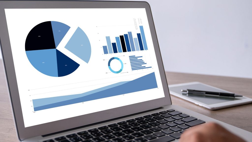
- Overall Satisfaction: (Bar chart displaying satisfaction ratings)
- Service Attributes: (Pie chart showing the distribution of satisfaction across key service attributes)
Key Findings:
- Overall satisfaction remains high, with 88% of respondents reporting satisfaction levels of 4 or 5 on a 5-point scale.
- Timeliness of service delivery emerged as the most critical attribute, with 92% of customers expressing satisfaction.
Detailed Analysis:
While satisfaction levels are positive, it’s crucial to examine the comments provided by dissatisfied customers. Several highlighted difficulties in reaching customer support, indicating room for improvement in communication channels.
3. Discussion and Interpretation
Contextualization:
Comparing our current satisfaction levels with industry benchmarks, we are ahead by 10%. This suggests that our recent service enhancements have had a positive impact.
Implications:
The high satisfaction with service attributes highlights our strengths. However, the challenges in reaching customer support demand immediate attention to maintain our overall positive reputation.
4. Recommendations
- Streamline customer support channels, ensuring quicker response times.
- Leverage customer feedback for targeted training programs to address areas identified by dissatisfied customers.
5. Conclusion
In conclusion, while our customer satisfaction levels are commendable, there are areas requiring our focus. By addressing the issues related to customer support and continuing our efforts to enhance service timeliness, we can further elevate the customer experience.
6. Appendices
Appendix A: Survey Questionnaire
(Include the full survey questionnaire for reference)
Appendix B: Raw Data
(Provide the raw survey data for transparency)
7. References
(Cite any external sources or references used in the report)
This example illustrates a comprehensive survey analysis report, but remember that each report may vary depending on the survey’s focus and objectives. Use this template as a guide to craft your reports effectively, ensuring that your organization not only collects data but also acts upon it to drive improvements.
