Time series graphs are indispensable tools for visualizing data that evolves over time. From financial trends to climate patterns, they provide valuable insights into historical and future trends. In this article, we’ll dive into some time series graph examples of time series graphs across various domains, showcasing their versatility and importance in understanding time-dependent data.
Practical Examples of Time Series Graph
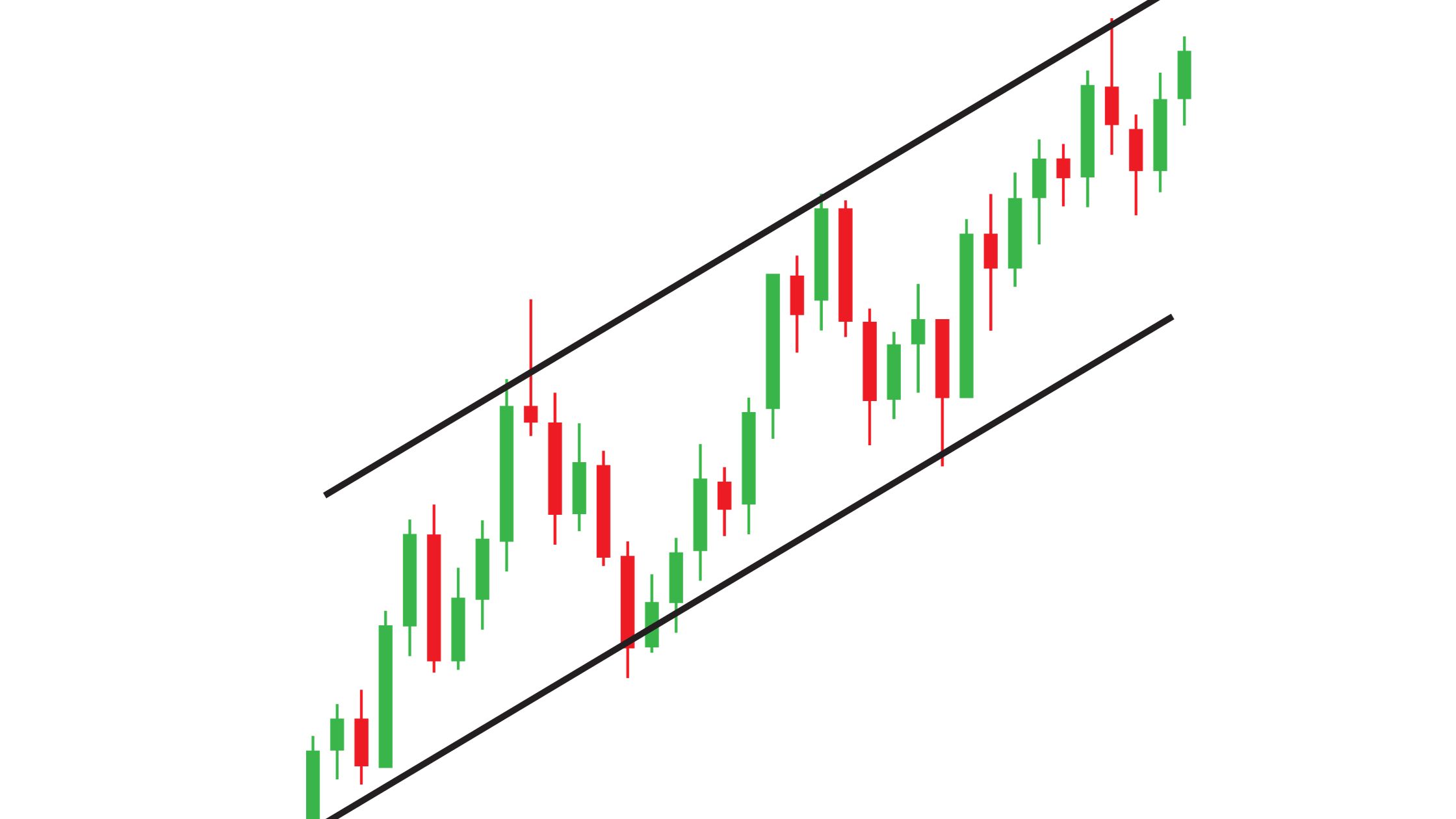
1. Stock Market Trends
Time series graphs are frequently employed to analyze stock market trends. They help investors and analysts track the historical performance of stocks, indices, or commodities. These graphs display price changes over time, enabling traders to make informed decisions.
Example: A time series graph of a tech company’s stock price over the past year can reveal patterns, such as fluctuations corresponding to earnings reports or market sentiment.

2. Weather and Climate Patterns
Meteorologists and climate scientists rely on time series graphs to study weather and climate patterns. These graphs display variables like temperature, rainfall, or atmospheric pressure over extended periods, aiding in climate modeling and weather prediction.
Example: A time series graph of monthly average temperatures can illustrate seasonal variations and long-term climate trends in a specific region.
3. Economic Indicators
Time series graphs are essential for analyzing economic data, including GDP, inflation rates, and unemployment figures. They help economists and policymakers identify economic trends and formulate strategies.
Example: A time series graph of a country’s GDP over several decades can highlight periods of growth, recession, and economic stability.

4. Website Traffic and User Behavior
Online businesses use time series graphs to track website traffic and user behavior. These graphs display metrics like page views, bounce rates, or conversions over time, helping website owners optimize their platforms.
Example: A time series graph of daily website traffic can reveal peak activity times, assisting in scheduling content updates or marketing campaigns.
5. Energy Consumption
Utility companies employ time series graphs to monitor energy consumption patterns. These graphs display data on electricity or gas usage over time, aiding in resource allocation and demand forecasting.
Example: A time series graph of daily electricity consumption in a city can highlight peak usage hours, guiding infrastructure planning.
6. Health and Medical Data
In healthcare, time series graphs are used to monitor patient vitals, disease progression, and treatment outcomes. They provide insights into medical trends and help doctors make informed decisions.
Example: A time series graph of a patient’s blood pressure readings over several months can indicate improvements or deteriorations in their health.
How to Create a Time Series Graph

Step 1: Gather Your Data
Before you can create a time series graph, ensure you have your data ready. Your dataset should include two columns: one for the time period (e.g., dates) and another for the data points you want to plot over time (e.g., sales figures, temperatures, stock prices).
Step 2: Open Excel
Launch Microsoft Excel and open a new or existing workbook on your computer or open an online Excel sheet.
Step 3: Input Your Data
Enter your time series data into Excel. Place the time period data (e.g., dates) in one column and the corresponding data points in another. Ensure that your data is organized chronologically.
Step 4: Select Your Data
Highlight the data you want to include in your time series graph. This typically involves selecting both the time period and data point columns.
Step 5: Insert a Chart
Navigate to the “Insert” tab in Excel’s ribbon at the top of the screen. In the Charts group, select the “Line” or “Scatter” chart type. Both of these chart types are suitable for time series data.
Step 6: Customize Your Chart
Once the chart is inserted into your worksheet, you can start customizing it to make it more informative and visually appealing. Here’s what you can do:
- Add Labels: Label your chart’s axes to provide context. Ensure the x-axis represents time, and the y-axis represents the data points.
- Titles and Legends: Add a title to your chart to indicate what it represents. If necessary, include a legend to clarify multiple data series.
- Formatting: Excel allows you to format your chart’s elements. You can change line colors, add data point markers, and adjust gridlines as needed.
- Data Series: If you have multiple data series to display, Excel makes it easy to add them to your chart. Simply click on your chart, then navigate to “Chart Elements” and choose “Data Series.”
- Time Formatting: Ensure your time axis is formatted correctly. Excel often does this automatically, but you can adjust it by right-clicking on the axis, selecting “Format Axis,” and specifying the date format you prefer.
Step 7: Interpret and Share
Your time series graph is now ready for interpretation. Analyze the trends, patterns, and anomalies it reveals. You can also use Excel’s chart-sharing features to export your graph for presentations or reports.
Concluding Thoughts
Creating time series graphs in Excel is a valuable skill for professionals in various fields, from finance to climate science. By following these time series graph examples and the step-by-step guide on how to create one, you can effectively visualize and communicate temporal data, unlocking valuable insights for data-driven decision-making.


