Microsoft Excel provides a robust set of charting capabilities to visualize data trends, compare metrics, and communicate insights through graphical representations. If we divide them into categories, there are 11 main types of charts available in Excel. These include Column Charts, Bar Charts, Line Charts, Pie Charts, Scatter Plot Charts, Area Charts, Doughnut Charts, Radar, Stocks, Histograms, and Waterfall Charts.
This article will walk through these 11 main types of charts available in Excel, their common use cases, formatting options, and design considerations to inform your visualization approach.
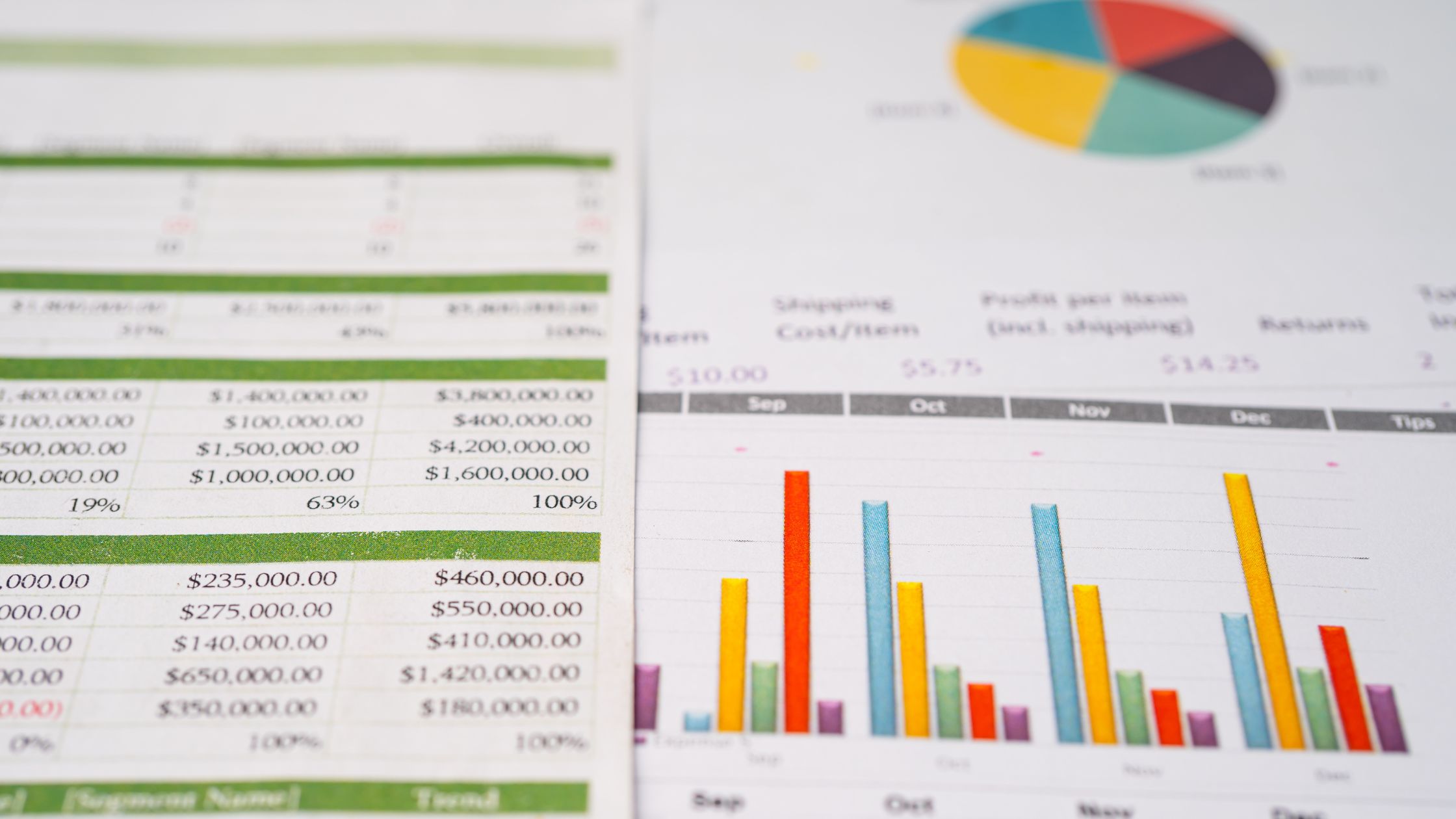
11 Types of Charts in Excel
1. Column Charts
The column chart displays vertical columns across a horizontal axis, which is useful for time-based trends like sales growth over the years. Column types include:
- Clustered Columns: Multiple data series
- Stacked: Values stacked atop each other
- 100% Stacked: Values stretch fully vertically
Use When: Comparing distinct values across categories like department expenses.
2. Bar Charts
The bar chart is the horizontal version of column charts, with horizontal bar lengths shown against a vertical axis. Bar types consist of:
- Clustered: Multiple data series
- Stacked: Values atop one another
- 100% Stacked: Bars fully horizontally stretched
Use When: Presenting data associated with specific labels like product sales.
3. Line Charts
As the name suggests, line charts display series as lines across an x/y axis. They showcase trends effectively when there are many data points. Types include:
- Basic Line: Single data series
- Stacked: Multiple stacked data series
- 100% Stacked: Overlapping lines totaling 100%
Use When: Highlighting trends over time with many data points like weekly website visitors.
4. Pie Charts
The circular pie chart splits a whole into sectors representing component percentages. Variations include:
- Basic Pie: Simple percentages
- Exploded Pie: Detaches select slices
- 3D Pie: Adds depth
Use When: Displaying proportional breakdowns like market share between competitors.
5. XY (Scatter) Plots
Scatter plots display values across both the x and y axes to exhibit correlations between two variables. Types are:
- Basic Scatter: Raw data points
- Smooth Lines: Curves through data
- Smooth Markers: Curved line with markers
Use When: Revealing relationships between values like sales vs. ad spending.
Recommended reading: How to Make a Scatter Plot in Excel with Two Sets of Data
6. Area Charts
Area charts are stacked line graphs emphasizing volume between a baseline. Types include:
- Basic Area: Single data series
- Stacked: Multiple data sets stacked
- 100% Stacked: Stacked fully to the vertical axis
Use When: Highlighting the magnitude of change over time like department expenses annually.
7. Doughnut Charts
Doughnut charts are essentially pie charts with a hole in the center, magnifying differences between percentages. Variants:
- Basic Doughnut
- Exploded Doughnut
Use When: Drawing attention to data slice proportions like customer acquisition channels.
8. Radar Charts
The radar chart’s spider-web appearance plots metrics along spokes from a center point. Used for:
- Basic Radar: Comparing multivariate data points
- Filled Radar: Area between lines filled
Use When: Displaying multiple comparing factors like employee competencies.
9. Stock Charts
These specialized graphs present fluctuating stock values using high/low/close values. Types:
- High-Low-Close: High, low, and closing values
- Open-High-Low-Close: Adds opening value
- Volume-High-Low-Close: Adds volume traded
Use When: Visualizing stock price patterns over time.
10. Histogram Charts
Histograms group data ranges into vertical bins showing value frequencies. Used for:
- Basic Histogram: Bars representing frequencies
- Pareto Histogram: Bars ordered from the most frequent
Use When: Analyzing statistical distribution shape or Pareto 80/20 rule.
11. Waterfall Charts
The waterfall chart shows cumulative positive and negative changes between metric starting and ending values. Best for:
- Basic Waterfall: Representing deficit/surplus effects
- Subtotal Waterfall: Intermediate subtotals
Use When: Connecting factors bridging between two amounts like analyzing profitability contributors.
Chart Selection Considerations in Excel
Even though Excel offers a large chart palette, not every chart is suitable for every type of data. Here are some chart selection considerations in Excel:
Data Structure: Certain visuals handle structured vs. unstructured data better
Data Volume: Simple charts beat complex ones with fewer data points
Trends Over Time: Line charts spotlight time-based trends well
Part-to-Whole: Pie charts best show proportional contributions to a whole
Correlations: Scatter plots handle correlating multivariate data points
Layering & Comparison: Bars/columns/areas allow stacking multiple data sets
Style & Formatting: Well-designed aesthetics enhance communication effectiveness
Audience: Chart clarity and complexity should align with the audience’s technical proficiency
Storytelling: Order charts in sequences that logically build analysis narratives
With knowledge of Excel’s expansive charting options plus purposeful decision-making, as you structure analytics content, it becomes easy to select the right visual for data insights to leap off the page.
Key Takeaways
The wide selection of built-in chart types available within Excel provides flexibility to apply the ideal chart for various datasets and what you aim to highlight.
Yet with the freedom to quickly insert many complex novel chart formats comes the responsibility to carefully consider intended messaging before determining chart choice and design.
By matching visuals with clarity and purpose to the trends and stories living within your datasets, Excel charts transform from nuanced decorations into irreplaceable analysis assets able to convince, teach, and inspire.
So be sure to leverage Excel’s full charting toolbox to make an impact with your data presentations!


