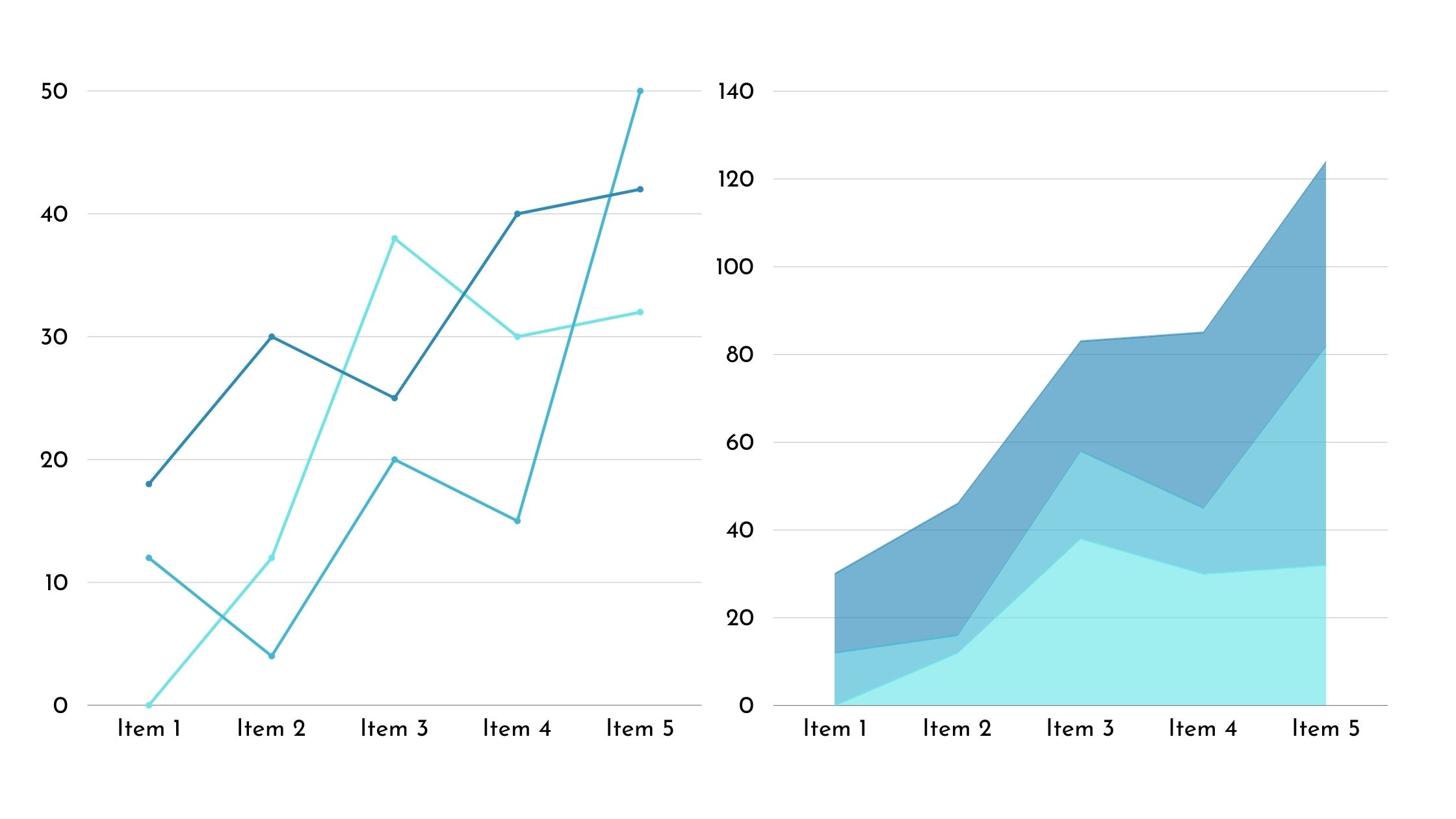
Charts in Excel are a valuable tool for managing and analyzing data. Instead of sifting through rows and columns of numbers, you can use charts to visually represent your data clearly and insightfully.
Charts go beyond simple data presentation. They allow you to uncover patterns, track progress, and highlight relationships that may be difficult to see in raw data. They can add value to your data analysis and decision-making processes by providing an easy way to understand information.
With charts in Excel, you can transform your data into meaningful visuals that tell a story at a glance.
5 Important Uses of Charts in Excel
While there are several uses of charts in Excel, here are the 5 of the most important ones.
1. Comparing Data
When comparing data in Excel, it’s important to use charts to visually represent the relationships and differences between different sets of information. Charts provide a quick and easy way to analyze trends, identify patterns, and make comparisons.
By using charts, you can easily see correlations, discrepancies, and outliers in your data without having to go through rows and columns of numbers.
With charts, you can choose from different types. Such as bar graphs, pie charts, line graphs, and scatter plots, depending on the nature of your data and the specific comparisons you want to make. This flexibility allows you to customize your visual representation to best fit your needs and effectively convey your message.
Additionally, charts in Excel allow you to manipulate and interact with the data dynamically. You can easily update the chart to reflect changes in the underlying data. Moreover, you can apply filters to focus on specific subsets and drill down into details for a closer examination.
This provides a more interactive and dynamic way to analyze and understand your data.
2. Visualizing Trends
Visualizing trends is another important use among uses of charts in Excel. To effectively visualize trends in Excel, you can use different types of charts. Bar graphs are useful for comparing different categories of data. Pie charts can show the proportion of each category in a dataset. Line graphs are great for displaying trends over time, making them ideal for visualizing changes and patterns. Scatter plots can help you identify relationships between two variables, allowing you to spot correlations or clusters in your data.
3. Showing Distribution
Excel offers two effective ways to display the distribution of your data: histograms and box plots.
Histograms are ideal for showing the frequency of data within specific ranges, allowing you to easily identify where the majority of your data falls. To create a histogram, select your data, go to the Insert tab, and choose Histogram. Excel will generate the chart for you, which you can customize further if needed.
On the other hand, box plots are useful for visualizing the distribution of data based on its minimum, first quartile, median, third quartile, and maximum values. This type of chart is particularly helpful for identifying outliers and understanding the spread of your data. To create a box plot, select your data, go to the Insert tab, and choose Box and Whisker Plot. Excel will create the chart, which you can adjust to fit your specific requirements.
4. Highlighting Relationships
Scatter plots and trendlines in Excel can be used to visualize relationships between different variables. Scatter plots are effective in showing relationships between two sets of data by plotting data points on a chart. This allows you to easily identify any correlations or patterns that may exist. Adding a trendline to the scatter plot can help you see the overall trend or direction of the relationship between the variables. This is particularly useful when you want to determine if there’s a linear, exponential, or other type of relationship between the variables.
Excel gives you the flexibility to customize the appearance of your scatter plot and trendline. You can choose different colors, markers, and line styles to make the chart visually appealing and easy to understand. By utilizing these features, you can effectively highlight and communicate the relationships between variables in your data. This empowers you to make informed decisions based on the insights gained.
It’s important to note that scatter plots and trendlines are valuable tools for analyzing and interpreting data. They provide a visual representation of the relationships between variables, allowing you to better understand the underlying patterns and trends. By using Excel’s scatter plot and trendline features, you can gain valuable insights from your data and make more informed decisions.
5. Tracking Progress
When it comes to tracking progress in Excel, using charts can be a helpful way to visually display changes and developments over time. By using charts, you can easily track trends, identify patterns, and make informed decisions based on the data you have.
Here are some tips on how to effectively use charts for tracking progress:
- Choose the Right Chart Type: Select a chart type that best represents your data. For example, you can use line charts to show trends over time or bar charts to compare progress across different categories.
- Take Advantage of Dynamic Chart Features: Excel offers dynamic chart features like data labels and trendlines that can enhance the visual representation of your progress tracking.