

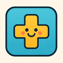
Business Medical cross Playful Free icon download
Download all to grab every PNG variant.
Imagine an icon that seamlessly blends the seriousness of healthcare with the structure of professional enterprise and yet radiates a vibrant sense of joy and lightheartedness—this is not just any symbol; it is a carefully crafted visual narrative. The icon in question stands as a unique synthesis of three powerful themes: Business, Medical Cross, and Playful. Each element contributes to a rich, layered identity that speaks to innovation, care, and approachability in equal measure.
The icon’s foundation lies in the formal attributes of modern business. It adopts clean geometric shapes—symmetrical lines, precise angles, and a balanced composition—that reflect professionalism and reliability. These qualities are essential for any corporate or entrepreneurial endeavor. The overall shape of the icon resembles a sleek, modern shield or a stylized business card turned into a badge—a symbol often associated with branding, trustworthiness, and strategic purpose. This structural integrity suggests that the entity behind this icon is not just imaginative but also operationally sound.
Subtle design cues reinforce its business identity: muted yet sophisticated color palettes—perhaps deep navy blue and soft silver—convey authority without being intimidating. The use of negative space is intentional, lending a minimalist aesthetic that mirrors efficiency and clarity in decision-making. A fine border or outline subtly emphasizes boundaries, symbolizing focus and discipline. These attributes are not merely decorative; they serve to establish credibility in a world where trust is currency.
At the core of this icon beats the universal symbol of healing—the Medical Cross. It is rendered with elegant precision, typically in white or bright cobalt blue, placed centrally within the business-oriented frame. This cross is not a mere afterthought but a deliberate centerpiece that anchors the icon’s mission: healthcare innovation driven by professional standards. The arms of the cross are proportionate and symmetrical, avoiding any distortion that might dilute its authenticity.
What sets this medical symbol apart from traditional representations is its integration. It does not clash with the business elements; instead, it harmonizes with them—its lines flow gently into the surrounding geometric frame, creating a sense of unity between care and commerce. This fusion speaks volumes: in today’s world, healthcare isn’t just about clinical excellence; it’s also about sustainable operations, data-driven decision-making, and patient-centered innovation—all hallmarks of modern business strategy.
The cross is subtly animated or designed with a slight gradient to suggest depth and dimensionality. In digital formats, the edges may glow faintly with a soft light—perhaps mimicking the gentle illumination of a hospital ward at night—reminding viewers of the life-saving work this icon represents. This attention to detail ensures that even from a distance, one can recognize its dual purpose: not just as an emblem for business growth but for healing and human well-being.
Now comes the transformative element—Playfulness. It is here that this icon transcends the conventional and becomes memorable, even delightful. The playfulness does not undermine professionalism; instead, it enhances it by making the symbol more relatable and approachable. A series of small, whimsical details are woven throughout: tiny stars orbiting the cross like a constellation of hope; a smiling sun peeking from behind one arm of the shield; or even minuscule cartoon-like figures—representing patients, doctors, and entrepreneurs—gently holding hands within the icon’s space.
Color is used with boldness and imagination. While base tones remain professional (blue, gray), accents burst forth in bright coral pink, lime green, and sunny yellow. These hues are not overwhelming; they appear only in carefully placed elements—the edge of a smile on a tiny face, the glow around the cross’s center, or decorative dots resembling confetti scattered across the background.
Even typography plays a role: if this icon includes text (as is common), it uses rounded sans-serif fonts with soft curves and friendly spacing. Letters may appear to "bounce" slightly or be adorned with tiny hearts or medical stethoscopes as decorative flourishes—just enough to evoke joy without sacrificing clarity.
The playfulness also extends into motion when used in digital interfaces. In animated versions, the icon might “breathe” gently—a soft pulsing of light around the cross—and occasionally, a single star will zoom across the screen before returning to its position. These micro-interactions invite engagement without distracting from purpose.
This icon is more than a visual element—it’s a philosophy. It embodies an era where healthcare and business are no longer at odds but are instead powerful allies in improving lives. The Business component ensures sustainability, strategy, and growth; the Medical Cross grounds it in purpose, care, and human dignity; and the Playful spirit injects empathy, creativity, and joy into what might otherwise be a rigid system.
In healthcare startups, wellness apps, or innovative medical tech companies striving to humanize their services—this icon serves as a beacon. It says: “We take our mission seriously. We believe in excellence. And yes—we also believe in smiling while doing it.”
By harmonizing professionalism with compassion and creativity, this icon stands as a modern masterpiece of visual storytelling—a true emblem of the future where healing and enterprise thrive together.
Create your own icon with our GoGPT AI prompt:
GoGPT