Discover how charts in Excel can transform raw data into clear, insightful visuals that uncover patterns and relationships, revolutionizing your data analysis process.
Category: Charts
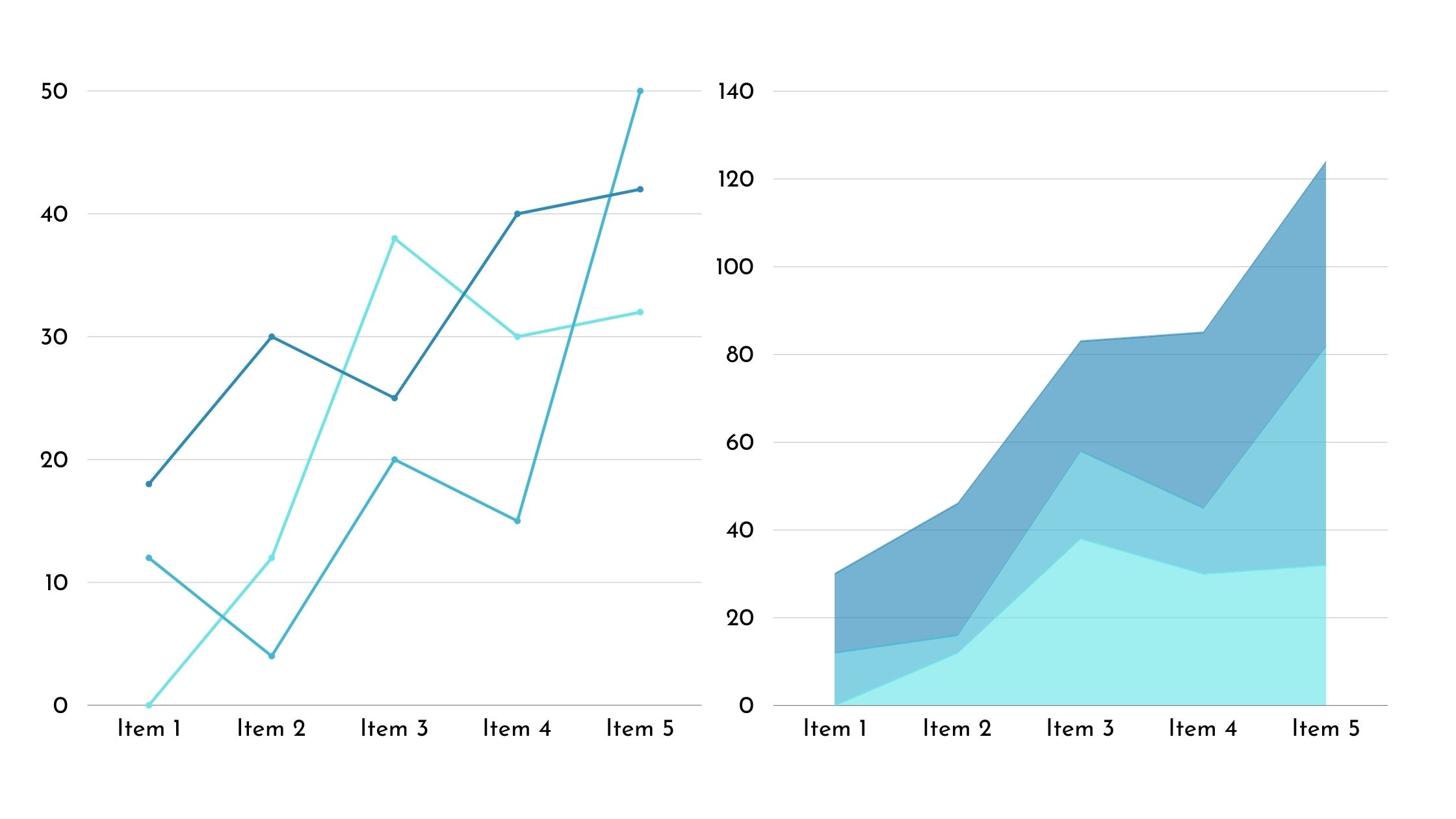
Microsoft Excel provides a robust set of charting capabilities to visualize data trends, compare metrics, and communicate insights through graphical representations. If we divide them

Want to visualize your data in a way that’s both informative and visually appealing? Look no further than the double bar graph! By combining two

Are you tired of feeling like you have no control over external factors? Don’t worry, because the control chart is here to help you. Think

Are you tired of feeling overwhelmed by a large amount of data? Take advantage of clustered column charts to bring clarity to your information! This

Unlock the power of data visualization with the versatile clustered bar chart! This chart brings together multiple bars, each representing different categories, to provide a
With data volumes multiplying exponentially across industries, effective visualization for accelerated insights is pivotal. While stalwart charts like bar graphs and pie charts dominate dashboards,

A comparison bar chart, often referred to simply as a bar chart or bar graph, is a graphical representation of data that uses rectangular bars

Understanding exactly how satisfied your customers are is crucial for delivering excellence and fueling business growth. Customer Satisfaction (CSAT) scores provide actionable data on sentiment.

Are you struggling to create a line graph in Excel? Look no further! This article will guide you through the process step by step. You’ll