Seesponsive in Chrome with OffiDocs
Ad
DESCRIPTION
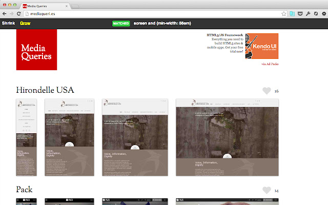
INTRODUCTION Seesponsive is a simple Google Chrome extension that allows you to see how a website's layout and design adjust responsively as the available screen width changes.
It also lets you see the media queries that are being progressively matched or unmatched, driving these changes.
USAGE To use the extension, just browse to a website that uses media queries.
Then click the extension's action button in the toolbar.
After a few seconds a black action bar will appear at the top of the page with two buttons - Shrink and Grow.
Clicking these will shrink and grow the width of the website to simulate the device width changing.
As this occurs the action bar will indicate which media queries are being matched/unmatched at a particular width.
To see some examples of sites that use media queries to adapt responsively visit Media Queries (http://mediaqueri.
es/).
Note: The Media Queries website is not in anyway affiliated with, nor does it endorse this extension.
It's just a really useful website that I've used in the screenshots purely for demonstration purposes.
KNOWN ISSUES Occasionally you may find that the loading message does not disappear and you get an error popup.
This is an known intermittent issue at the moment.
Usually reloading the page and trying again solves it.
SOURCE CODE This extension is open source under the MIT licence.
See the Github project for details and code: https://github.
com/devilishio/seesponsive
Additional Information:
- Offered by Simon Collins
- Average rating : 5 stars (loved it)
Seesponsive web extension integrated with the OffiDocs Chromium online


